Предполетная векторная настройка: Нанесение ограничивающей рамки на неправильные силуэты
Создание желтого знака рабочего требует тщательной предполетной подготовки файлов.. Стандартные прямоугольные знаки обеспечивают единые границы.. Однако, неправильные человеческие силуэты представляют собой серьезные геометрические проблемы для стандартной типографской компоновки.. Неправильный расчет векторов холста приводит к серьезным ошибкам печати.. Это также приводит к дорогостоящим изменениям центровки во время высокоскоростного производства..
Неправильно настроенные файлы приводят к серьезным несоответствиям данных между вашей печатной машиной и режущими плоттерами.. Настоящее техническое руководство устанавливает строгий порядок предполетной подготовки.. Он стабилизирует ваши векторные пути. Более того, он защищает вашу пользовательскую графику и оптимизирует рабочий процесс для автоматизированного высекального оборудования заводского масштаба..
Определение основной ограничивающей рамки против. Линии внешней высечки
Вы должны заранее отделить зону печати от механических путей резки.. Откройте Adobe Illustrator или CorelDRAW, чтобы создать основное цифровое рабочее пространство.. Создайте 1:1 точно масштабировать артборд 1200 мм в высоту. Следующий, наметить профиль внешнего периметра вектора силуэта человека. Эта линия представляет собой абсолютную границу пути механической матрицы..
Никогда не размещайте текст непосредственно на этой внешней линии периметра.. Вместо, определить изолированный, неправильная прямоугольная граница внутри области груди и живота. Эта область — ваше ядро “Область холста туловища”. Стандартные отраслевые размеры этой внутренней зоны: 800 мм в высоту и 450 мм в ширину.
Блокировка основного обмена сообщениями внутри этой внутренней матрицы защищает структуру макета.. Это гарантирует, что ваша типографика останется идеально центрированной.. Это также гарантирует максимальную визуальную фокусировку на хорошо видимых границах придорожной полосы..
Правило безопасного запаса 30–50 мм для предотвращения истирания кромок
Механические планшетные высекальные станки работают на невероятно высоких скоростях и в условиях интенсивного физического давления штамповки.. Незначительное смещение материала происходит при производстве тяжелых полимеров.. Поэтому, вы должны обеспечить строгую буферную зону безопасности между вашей типографикой и линией разреза.. Поддерживать минимальную маржу 30 мм по всем элементам изображения. Для достижения наилучших производственных результатов, вместо этого используйте безопасный зазор в 50 мм..
Неспособность создать эту буферную зону создает серьезные технические проблемы в цехах завода.:
- Обрезка текста: Незначительные автоматические сдвиги выравнивания приведут к прямому обрезанию ваших надписей..
- Край изнашивается: Режущие ножи, приближающиеся слишком близко к толстым слоям чернил, разрывают защитную желтую виниловую пленку..
- Попадание влаги: Зубчатые края позволяют воде проникать в рифленые каналы., вызывая быстрое отслоение клея.
Соблюдение этого допуска по пространству полностью исключает структурные браки.. Он сохраняет ваш желтый знак рабочего в первозданном виде и делает его хорошо заметным в течение нескольких месяцев суровых условий эксплуатации..
Управление опорными точками для обеспечения точности многослойной печати и резки
Точное отслеживание многоуровневых регистров требует чистых векторных путей с минимальным количеством опорных точек.. Посторонние или беспорядочные точки крепления сбивают с толку автоматизированные фрезерные станки с ЧПУ и тяжелые штамповочные ножи.. Они вызывают заикание режущего лезвия на поворотах.. Это заикание делает меня грубым, неровные края готового продукта. Очистите векторные контуры, используя функции упрощения инструмента «Перо».. Убедитесь, что каждый изогнутый радиус имеет гладкий вид., хорошо распределенные ручки Безье.
Организуйте свой мастер-файл, используя строгую трехуровневую иерархию слоев.. Эта структура оптимизирует заводское производство.:
- Слой 1 – Умереть Путь: Разместите свой 1:1 масштабировать путь вырезания здесь. Раскрасьте его в ярко-пурпурный плашечный цвет.. Обозначьте это четко как “НЕ ПЕЧАТЬ”.
- Слой 2 – Текст/художественное произведение: Разместите свою насыщенную черную типографику, логотипы компании, и символы опасности здесь.
- Слой 3 – Рего Маркс: Позиция стандартная черная 5 Цели регистрации мм за пределами периметра пути штампа.
Оптические датчики на планшетных печатных машинах сканируют эти конкретные регистрационные метки.. Такое выравнивание идеально соответствует печатному слою физическим лезвиям для высечки.. Расширенная настройка файлов допечатной подготовки оптимизирует скорость производства. В конечном счете, он обеспечивает безупречную резкость, устойчивые к атмосферным воздействиям знаки для развертывания тяжеловесного автопарка.
Противодействие эффекту ореола: Выбор шрифта для флуоресцентного безопасного желтого цвета
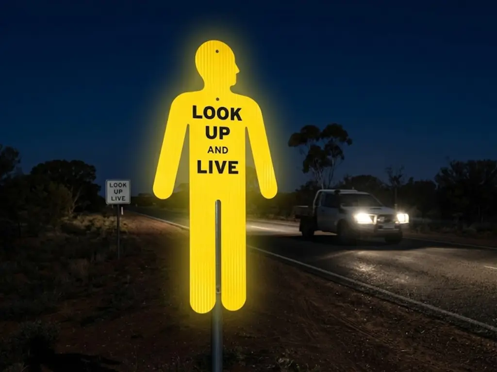
Наружная среда создает суровые оптические условия для временных знаков безопасности.. Интенсивный солнечный свет и дальний свет фар отражаются от флуоресцентного безопасного желтого фона.. Это интенсивное отражение вызывает серьезные визуальные искажения, известные как эффект ореола.. Светящиеся световые волны расходятся наружу от ярко-желтой пленки.. Эти волны активно вторгаются в текст, напечатанный черной краской..
Как результат, темные буквы издалека кажутся меньше и размытыми. Выбор неправильного семейства шрифтов ускоряет этот визуальный сбой.. Водители не могут вовремя расшифровать предупреждающее сообщение. Правильное типографское планирование блокирует это оптическое кровотечение.. Выбор устойчивых геометрических форм букв гарантирует, что ваше сообщение будет проходить сквозь интенсивные блики окружающей среды..
Почему стандартные шрифты с засечками и тонкие шрифты не работают на обочинах дорог
Стандартные шрифты с засечками, такие как Times New Roman, ухудшают читабельность на дороге.. Шрифты с засечками имеют сложные декоративные ножки и переменную ширину штрихов.. Эффект ореола полностью стирает эти тонкие горизонтальные терминалы.. Под прямыми солнечными лучами, светящийся желтый фон растекается по тонким линиям. Персонажи быстро теряют свои уникальные геометрические профили..
Более того, тонкий шрифт или светлый шрифт полностью исчезают на расстоянии. Водителям, движущимся на высоких скоростях, требуется немедленное визуальное распознавание.. Размытые или размытые буквы увеличивают когнитивную нагрузку водителя.. Эта задержка сокращает критическое время реакции на торможение.. Вы должны строго запретить все стили шрифтов с засечками и деликатные шрифты в макетах знаков безопасности перед печатью..
Лучшие тяжелые шрифты без засечек для обеспечения высокой контрастности
Вы должны использовать ультражирный шрифт, Семейства шрифтов высокой жесткости без засечек для обеспечения высококонтрастного текста для приложений с желтым фоном безопасности. Шрифты, такие как Arial Bold, Гельветика Черный, и Impact обеспечивают превосходную структурную устойчивость к оптическому кровотечению.. Эти шрифты имеют толщину, равномерные удары и широкие внутренние стойки.
Тяжелая блочная структура не позволяет отражать световые волны и уменьшать персонажей.. Эта геометрическая стабильность обеспечивает четкую читаемость на длинных дистанциях читаемости придорожных знаков.. Водители могут легко идентифицировать отдельные формы букв в условиях плохого освещения..
Использование этих надежных семейств без засечек гарантирует, что важные текстовые команды останутся четкими и отчетливыми..
Равномерность веса хода и геометрическая стабильность при ярком свете
Для превосходной читаемости требуется идеальная однородность веса штрихов по всему векторному дизайну.. Промышленные дизайнеры должны оценивать каждую форму буквы на смоделированных границах расстояний.. Убедитесь, что в основном тексте предупреждения используется сплошной цвет., несжатая толщина шрифта. Это обеспечивает оптимальное соотношение ширины и высоты..
Для вспомогательных акцентов дизайна, таких как бордюры или рамки., вы должны разработать точные веса линий. Сохраняйте толщину векторного штриха не менее 15 пунктов для всех вспомогательных графических линий..
Тонкие границы размываются под интенсивным светом фар. Толстый, равномерные штрихи визуально закрепляют макет. Они не позволяют яркому желтому носителю перегружать вашу пользовательскую графику.. Этот инженерный подход обеспечивает четкую, профессиональные результаты на производственной линии.
Оптический кернинг & Регулировки отслеживания для четкости на высокой скорости
Стандартное программное обеспечение для настольных издательских систем использует межбуквенный интервал по умолчанию, предназначенный для чтения крупным планом.. Однако, Расстояние читаемости придорожных знаков требует совершенно других геометрических правил.. Транспортные средства, движущиеся на высоких скоростях, сокращают время просмотра для водителя до нескольких секунд.. Если ваша векторная типографика тесна, стандартный кернинг, персонажи сливаются в темную массу.
Это визуальное размытие полностью портит понимание сообщения.. Дизайнеры должны изменять межбуквенный интервал вручную на этапе предпечатной проверки.. Точные настройки защищают независимость персонажей в суровых условиях просмотра.. Оптимизация этих векторных пространств гарантирует, что автомобилисты мгновенно расшифровывают предупреждающие слова, проезжая мимо рабочих зон..
The 10% к 15% Расширенное правило отслеживания для наружных вывесок
Модификации ручного отслеживания предотвращают затекание букв друг в друга на светоотражающих виниловых поверхностях.. Откройте панель программного обеспечения для редактирования векторов.. Выберите основной текст предупреждения и увеличьте отслеживание по умолчанию на 10%+15%. Эта ручная калибровка учитывает интенсивное световозвращающее свечение, указанное в стандарте AS/NZS. 1906.1:2014, создание стабильного визуального воздушного зазора.
Дополнительное негативное пространство действует как защитный барьер от яркого солнечного света.. Он поддерживает четкое определение персонажей издалека.. Применение этого правила гарантирует, что ваш Типография знака желтого человека остается четким и читаемым в полевых условиях.
Предотвращение слияния персонажей и визуального перекрытия на расстоянии
Физика визуального перекрытия заставляет определенные комбинации символов сливаться на расстоянии.. Когда транспортные средства приближаются к временному знаку безопасности, малый интервал между буквами смешивает соседние прямые или диагональные линии..
- Линейное слияние: Буквы “Л” и “я” сливаются в единую блочную форму.
- Угловое перекрытие: Персонажи “V.” и “Э” кровоточить по их граничным краям.
Это геометрическое искажение создает нечитаемые формы., делая знак безопасности бесполезным. Водители не могут быстро идентифицировать отдельных персонажей.. Расширение значений оптического кернинга устраняет эту проблему физического смешивания.. Это гарантирует, что каждый персонаж сохранит свой уникальный силуэт.. Эта калибровка расстояния сохраняет жизненно важные буферы считывания для приближающихся автомобилистов..
Негативное управление пространством внутри силуэта туловища
Отличный дизайн макета B2B требует точного управления негативным пространством на холсте человеческого силуэта туловища.. Вы должны сбалансировать общую площадь темной печатной краски с открытым безопасным желтым фоном..
Не перегружайте область груди гигантскими, негабаритные текстовые блоки. Держите свой черный текст под контролем. 40% площади ограничивающей рамки ядра. Этот расчет максимизирует коэффициент контрастности на панели знака.. Если оставить достаточное желтое пространство, обрамляющее текстовые столбцы, это усилит воздействие сообщения.. Эта стратегия гарантирует четкую разборчивость и поддерживает профессиональные стандарты презентации..
Математическое масштабирование: Высота надписи против. Расстояние читаемости на обочине
Дизайн придорожных указателей требует строгих математических расчетов, а не художественных догадок.. Графические дизайнеры часто масштабируют текст, чтобы он визуально соответствовал доступному пространству холста.. Однако, такой подход рискует создать серьезную угрозу безопасности на высокоскоростных гражданских дорогах..
Если ваша типографика слишком мала, водители не могут вовремя прочитать сообщение. Вы должны рассчитать размеры букв на основе скорости автомобиля и физики торможения водителя.. Этот научный метод масштабирования обеспечивает надлежащую читаемость.. Это дает автомобилистам достаточно времени для чтения, процесс, и безопасно реагировать на изменение условий дорожного движения впереди.
Визуальное уравнение AU: 10мм Высота за 5 Метры обзора
В основе масштабирования высококонтрастного придорожного текста лежит строгая динамика гражданской авиации и шоссе.. Под АС 1742.3 Приложение D. Рекомендации, Австралийская инфраструктура требует строгого базового уровня: каждые 10 мм высоты заглавных букв дают 5 метров четкого расстояния просмотра при нормальном дневном освещении.
Для 80 км/ч (50 миль в час) зона скорости, где время реакции автомобиля снижается до миллисекунд, вы должны указать минимальную высоту заглавных букв 6 дюймы (152.4мм) чтобы обеспечить водителям безопасность, реалистичное окно восприятия на расстоянии 180 футов. Использование произвольных визуальных соотношений нарушает федеральные стандарты безопасности на дорогах..
Такой размер гарантирует приближению автомобилиста на расстоянии не менее 60 м от свежего снега., хорошая видимость до того, как они достигнут знака. Это математическое дополнение предотвращает позднее маневрирование при торможении и защищает уязвимые гражданские полевые бригады..
Расчеты компоновки для зон скорости 60 км/ч и 80 км/ч
Различные зоны скорости движения диктуют разные требования к высоте надписей временных знаков безопасности.. Более высокие скорости перемещения требуют гораздо больших расстояний физического распознавания..
- 60 км/ч Зоны: Транспортные средства едут по 16.6 м в секунду. Дизайнеры должны использовать как минимум 120 текст высотой мм, обеспечивающий окно чтения в 3,6 секунды..
- 80 км/ч Зоны: Транспортные средства едут по 22.2 м в секунду. Вам необходимо увеличить минимальную высоту буквы до 160 мм или 200 мм.
Эти показатели масштабирования строго соответствуют австралийским стандартам.. Под АС 1742.3:2019 Раздел 4.3, буквы, используемые на временных многополосных или высокоскоростных дорожных работах, должны соответствовать стандартным классификациям визуальных серий. (Серия c, Дюймовый, или Е) чтобы гарантировать достаточное время восприятия водителем.
Использование меньших шрифтов нарушает эти основные концепции видимости.. Это лишает автомобилистов возможности видеть непосредственные опасности.
Вертикальный стек против. Пропорции горизонтального растяжения
Большой размер, Яркие надписи внутри неправильной формы человека требуют продуманной композиции макета. Дизайнеры часто растягивают символы по горизонтали, чтобы заполнить пустые промежутки на холсте знака.. Однако, искажение пропорций шрифта разрушает привычные профили букв, которые водители мгновенно распознают.
Никогда не превышайте максимальный коэффициент вертикального растяжения 105%. Чрезмерное растяжение сужает внутренние контуры шрифта.. Это сужение приводит к тому, что буквы расплываются под сильным ярким светом.. Вместо растягивания персонажей, используйте плотную вертикальную компоновку стопки. Разбейте предупреждающее сообщение на две или три короткие текстовые строки.. Этот метод укладки идеально соответствует естественным контурам холста туловища.. Он обеспечивает максимальную читаемость без изменения геометрии шрифта..
Интеграция графических символов безопасности: Пропорции и визуальная иерархия
Текст сам по себе не всегда может сообщить о непосредственной опасности для быстро движущихся автомобилистов.. Интеграция четких графических символов безопасности вместе с предупреждающей типографикой ускоряет когнитивные процессы человека.. Водитель распознает интуитивно понятный значок опасности гораздо быстрее, чем стандартные текстовые блоки.. Однако, плохо масштабируемая графика не может эффективно взаимодействовать.
Неправильное расположение значков нарушает схему оформления и сбивает с толку приближающихся водителей.. Дизайнеры должны применять строгую пропорциональную математику, чтобы сбалансировать символы и текст.. Эта стратегическая интеграция создает мощную визуальную иерархию.. Это гарантирует, что ваши сообщения о безопасности остаются высокоэффективными в сложных придорожных условиях..
Размер значков опасностей (Молнии & Стрелы) Относительно текста
Графические символы требуют агрессивного векторного масштабирования, чтобы конкурировать с большими, текстовые слои с высокой видимостью. Маленький, сжатые значки полностью исчезают при просмотре с дальней дистанции читаемости придорожных знаков. Вы должны убедиться, что значки основных опасностей занимают не менее 35% общей площади макета ограничительной рамки.
Масштабирование стрелки направления или высоковольтной молнии до этих размеров сохраняет структурный баланс.. Такое соотношение размеров гарантирует, что символ выделяется среди жирных текстовых линий.. Водители могут мгновенно определить конкретный тип опасности, прежде чем они смогут прочитать вспомогательные слова..
Размещение графического изображения, соответствующего требованиям ISO/AS, на корпусе неправильной формы.
Размещение изображений безопасности на фигуре человека неправильной формы требует строгого соблюдения австралийского стандарта AS. 1319-1994 Раздел 2.3. Пиктограмма опасности должна быть заключена в соответствующий равносторонний треугольник с черной рамкой на флуоресцентно-желтом фоне., располагается прямо над текстом сообщения.
Панель графических пиктограмм должна содержать сплошной черный символ на совершенно белом фоне внутри определенного визуального контейнера.. Хранение символов в независимых векторных зонах, располагается прямо над текстом сообщения, соответствует федеральным нормам безопасности. Этот дисциплинированный рабочий процесс макетирования позволяет избежать дорогостоящих юридических обязательств за непредупреждение в коммерческих секторах..
Вы должны разместить эти приоритетные символы непосредственно над или под основным стопкой типографики.. Никогда не перекрывайте текстовый путь графическими векторами.. Наложение значков на слова полностью разрушает разборчивость текста.. Размещение символов в независимых векторных зонах соответствует национальным нормам соответствия.. Этот простой рабочий процесс компоновки обеспечивает быструю идентификацию сообщений на быстрых гражданских границах..
Избегайте визуального беспорядка, чтобы сохранить концентрацию внимания водителя
Превосходный дизайн визуальных ресурсов отдает предпочтение исключительной простоте, а не декоративным деталям.. Сложные векторные рисунки, мелкие эскизные пометки, или цветовые градиенты полностью выходят из строя во время промышленного производства. Цифровые УФ-струйные принтеры и высокоскоростные литографические машины не могут воспроизвести тонкие линии на грубой светоотражающей виниловой пленке..
Вместо, всегда обеспечивать чистоту, векторные пути со сплошной заливкой для каждого символа. Устраните ненужные элементы дизайна, чтобы снизить когнитивную нагрузку водителя.. У автомобилистов есть считанные секунды, чтобы безопасно рассмотреть придорожные указатели.
Чистый, минималистичная планировка предотвращает опасный визуальный беспорядок. Он направляет внимание водителя непосредственно на основное сообщение об опасности., обеспечение высокой безопасности рабочих зон.
Оптимизация допечатной подготовки для крупномасштабного производства
Преобразование индивидуального графического дизайна в тысячные партии продукции требует абсолютной технической точности.. Небрежная передача файлов создает серьезные проблемы на типографии. Небольшие расхождения в макете вектора оборачиваются дорогостоящими отходами подложек.. Цифровые проекты должны пройти строгую предпечатную проверку, прежде чем они попадут в промышленные планшетные печатные машины..
На этом этапе ваши творческие ресурсы согласовываются с физическими производственными возможностями.. Оптимизация параметров чернил и путей привязки стабилизирует крупномасштабные производственные циклы.. Это также обеспечивает абсолютную визуальную однородность всего вашего парка придорожных знаков..
Треппинг плашечных цветов и характеристики плотности черных чернил (Рич Блэк против. Ключ черный)
Стандартный 100% Ключевая формула черных чернил часто выглядит размытой на светоотражающей пленке.. Промышленные УФ-лампы для отверждения делают чистые черные чернила темно-серыми.. Это затухание серого резко снижает контрастность текста на желтом фоне..
Вы должны указать плотную, вместо этого насыщенный черный состав чернил. Установите цифровую цветовую палитру на C.:60%, М:40%, Да:40%, К:100%. Наложение голубого, пурпурный, и желтые пигменты создают глубокий, сплошной черный тон. Эта насыщенная черная смесь устойчива к выцветанию на солнце.. Он сохраняет четкость, высококонтрастный вид при длительном воздействии на открытом воздухе.
Распределение выпуска за обрез для экструзии листов большой мощности
Неправильные человеческие силуэты подвергаются физическому смещению материала во время автоматизированных процедур высечки.. Экструзионные листы сверхпрочного полимера слегка скользят под штамповочными ножами под высоким давлением.. Без правильного распределения кровотечения, это движение оставляет сырым, непропечатанные края.
Вы должны расширить фоновую графику далеко за пределы окончательных линий разреза.. Примените буфер за обрез толщиной не менее 5 мм по всему периметру векторного силуэта..
Этот структурный запас прочности маскирует незначительные ошибки автоматического выравнивания.. Гарантирует сплошное покрытие цвета вплоть до окончательного готового края..
Оптимизация цифрового подтверждения передачи на заводе
Ошибки подстановки шрифтов портят геометрию макета при перемещении файлов в разные операционные системы.. Производственные компьютеры автоматически заменяют недостающие текстовые слои универсальными системными шрифтами.. Это искажение искажает ваши тщательно рассчитанные показатели расстояния читаемости придорожных знаков..
Перед экспортом необходимо преобразовать каждый элемент типографики в необработанные векторные контуры.. Выберите текстовые блоки и используйте сочетание клавиш. Это действие фиксирует ваши буквы в постоянных математических якорных путях..
Преобразование текста в контуры предотвращает автоматическую модификацию программного обеспечения.. Это гарантирует, что на заводе безупречная печать вашего точного макета..
💡 Примечания к допечатной подготовке B2B: Калибровка сложных векторных траекторий для неправильных силуэтов может стать узким местом для собственных художественных групп.. Как полностью интегрированный производитель дорожных знаков, контролирующий весь процесс от экструзии необработанного листа до автоматизированных штамповочных прессов высокого давления., мы гарантируем идеальную совмещение отпечатка к вырезу с точностью до миллиметра, которая идеально сохраняет заданные границы читаемости вашего макета.
Завершение проекта: Переход от векторного доказательства к физическому активу
Переход от цифрового рабочего пространства к физическому придорожному знаку требует абсолютного внимания к деталям.. Незначительные дефекты на маленьком экране превращаются в серьезные производственные дефекты при увеличении до 1200 физическая табличка мм. Промышленное печатное оборудование не может автоматически исправлять неправильный выбор форматирования или перекрытие строк..
Производственная линия печатает векторную пробную версию в том же виде, в каком вы ее предоставили.. Внедрение заключительного этапа контроля качества позволяет заранее выявить технические ошибки в файлах.. Этот строгий процесс проверки защищает ваш производственный бюджет и гарантирует безупречную работу окончательных средств физической безопасности в суровых придорожных условиях..
Контрольные списки проверки для штатных верстальщиков
Ваша художественная группа должна провести окончательную предполетную проверку перед отправкой объектов на завод.. Пропуск этого шага может привести к созданию дорогостоящих структурных отходов и задержке поставок.. Проверьте свой мастер-файл на соответствие этому контрольному списку утверждения проекта, состоящему из 4 пунктов, чтобы убедиться в абсолютном соответствии требованиям.:
- Зазор ограничивающей рамки: Подтвердите минимум 30 мм до 50 Между всеми текстовыми путями и внешним контуром высечки существует буфер безопасного поля в мм..
- Процент отслеживания шрифтов: Искажение шрифта разрушает показатели распознавания слов драйвера на высоких скоростях. В соответствии с разделом 2L MUTCD.04 критерии соответствия, все нестандартные знаки должны использовать стандартизированные геометрические профили., обеспечение соотношения ширины и высоты символов между 0.7 и 1.0.
- Профиль насыщенного черного цвета: Убедитесь, что все элементы темного текста используют плотную букву C.:60%, М:40%, Да:40%, К:100% настройка чернил вместо базовой клавиши черного цвета.
- Метрики масштабирования значков: Убедитесь, что основные графические символы безопасности занимают не менее 35% всей площади холста туловища для закрепления визуальной иерархии.
Вместо того, чтобы тратить оплачиваемые часы на набросок физического силуэта с нуля., вы можете переместить свои слои типографики прямо в нашу точную, Готовые к производству векторные шаблоны и блоки САПР для желтых рабочих знаков. Блокировка этих основных элементов предотвращает ошибки макета.. Эта строгая проверка гарантирует, что ваши окончательные печатные вывески идеально соответствуют утвержденным цифровым проектам..
Преодоление разрыва между компоновкой экрана и промышленным оборудованием
Окончательные настройки экспорта определяют, насколько плавно заводское оборудование обрабатывает ваши векторные траектории.. Сохраните готовый к работе файл в чистом, несжатый формат PDF/X-4 для сохранения отдельных данных векторного слоя. Этот формат обеспечивает точное разделение между печатными изображениями и инструкциями по механической резке..
Чтобы проверить, как выбранный вами точный шрифт и векторные контуры передаются на заводе без потертостей краев., обратитесь к нашему техническому руководству по изготовлению вывесок из корфлейта желтого человека.. Эта перекрестная ссылка устраняет разрыв между цифровым проектированием и ограничениями физических инструментов..
Освоив эти векторные параметры микроуровня, вы будете уверены, что ваши печатные отпечатки идеально соответствуют более широкому конвейеру визуальных ресурсов, подробно описанному в нашем комплексном Руководство по дизайну и макету нестандартных знаков желтого человечка. Такое согласование оптимизирует весь производственный процесс., обеспечение максимальной долговечности и исключительной видимости ваших временных знаков безопасности на объектах активных строительных работ..
Часто задаваемые вопросы по макету (Часто задаваемые вопросы)
Какое семейство шрифтов лучше всего использовать при разработке индивидуальных знаков желтого человечка??
Тяжелый, чистые шрифты без засечек, такие как Arial Bold, Гельветика Черный, или Влияние — это абсолютные отраслевые стандарты.. Вы должны полностью избегать шрифтов с засечками. (как Таймс Нью Роман) или декоративные надписи, потому что их тонкие линии и замысловатые узоры полностью размываются под интенсивным австралийским солнечным светом и отражениями дальнего света фар..
Почему стандартные настройки отслеживания типографики выглядят размытыми или перемешанными на придорожном знаке безопасности?
Это вызвано “Эффект ореола,” оптический феномен, при котором очень яркий безопасный желтый фон переходит в темный печатный текст, если смотреть на него с расстояния.. Чтобы исправить это, дизайнеры должны вручную расширять возможности отслеживания/кернинга, 10% к 15% за пределами стандартных настроек печати по умолчанию, чтобы поддерживать четкое, разборчивый воздушный зазор между символами.
Сколько свободного поля я должен оставить между текстовым макетом и внешним краем выреза желтого человечка??
Вы всегда должны поддерживать строгую безопасную буферную зону от 30 до 50 мм между ограничительной рамкой текста и внешней линией обрезки.. Все, что находится ближе, подвергает ваш текст риску быть обрезанным во время автоматической механической штамповки или преждевременному расслоению кромок из-за атмосферных воздействий на месте..
Как рассчитать правильную высоту буквы для зоны строительных работ со скоростью 80 км/ч??
Соблюдайте стандартный коэффициент читаемости вывесок Австралии.: 10мм высоты буквы на 5 метров расстояния просмотра. Для зоны со скоростью 80 км/ч, где водителям требуется более длинный буфер реакции. (по меньшей мере 80 к 100 метры видимости), ваш текстовый макет должен иметь минимальную высоту заглавных букв от 160 до 200 мм..
Стоит ли использовать чистый черный (К:100) или насыщенные черные чернила при настройке слоев рисунка.?
Всегда используйте однопигментные черные чернила с УФ-отверждением, соответствующие стандарту AS/NZS 1906.1.. Стандартные коммерческие смеси CMYK блокируют световозвращающую способность., тогда как одобренные жидкости для точечной черной окраски обеспечивают полную непрозрачность и превосходную устойчивость к ультрафиолетовому излучению, не превращаясь в уголь..
Ссылка
КАК 1742.3:2019 – Руководство по единым устройствам регулирования дорожного движения, Часть 3: Управление дорожным движением при работах на дорогах