Отклоненный макет вывески стоит больше, чем плата за перепечатку. Это стоит простоя сайта, неудавшийся аудит, или хуже.
Сотрудники службы безопасности на объекте и штатные проектировщики сталкиваются с реальной проблемой. Получение Желтый корфлейтовый дизайн знака человека соответствует стандарту AS 1319-1994 сложно, одновременно соблюдая требования бренда и конкретного сайта.. Игнорировать это, и осадки быстро накапливаются. Небольшой текст не проходит проверку на разборчивость, а плохой контраст замедляет реакцию водителя
Это руководство решает эту проблему напрямую.. Он помогает австралийским офицерам безопасности и графическим дизайнерам разобраться с макетом., типографика, стандарты подготовки и разборчивости векторных файлов. Каждый Желтый корфлейтовый дизайн знака человека выход из-за стола должен соответствовать требованиям, разборчиво и готово к использованию на сайте.
Почему точность планировки определяет эффективный знак безопасности работников
Плохая планировка не только выглядит непрофессионально на австралийском рабочем месте.. Он активно замедляет распознавание, когда водители, операторы установок, и пешеходы должны реагировать быстрее. Безопасный труд Австралии 2025 отчет записан 188 гибель рабочих в 2024. Причиной стали дорожно-транспортные происшествия 42% (79 смертельные случаи), и падения с высоты составили дополнительную 13% (24 смертельные случаи). Только три отрасли, в том числе строительство, на долю которых приходится большая доля всех смертей рабочих. Это именно та среда, в которой Желтый корфлейтовый дизайн знака человека делает свою самую тяжелую работу.
Цена плохой планировки на рабочих местах высокого риска в Австралии
Загроможденное произведение искусства, переполненные текстовые блоки и непоследовательное масштабирование значков уменьшают окно реакции водителя при приближении. Знак, требующий второго взгляда, уже не справился со своей задачей.
Что “Дизайн” Фактически означает в контексте соблюдения требований
The Желтый корфлейтовый дизайн знака человека это не украшение. Каждое решение макета — размер значка, интервал, размещение цвета — либо поддерживает, либо ухудшает читаемость на необходимом расстоянии просмотра.
Тогда как 1319-1994 Учитывается в ваших дизайнерских решениях
КАК 1319-1994 (Знаки безопасности для производственной среды) это основа управления, в частности раздел 3 (Дизайн вывесок). Хотя стандарт не диктует толщину или материал подложки, Пункт 3.4 (Знак знака, Легенда и разборчивость) строго регулирует пропорциональный размер, иерархия макета, и контрастность иконок и текста. Офицеры по безопасности на объекте должны относиться к этому пункту как к абсолютному описанию проекта, а не как к гибкой рекомендации..
Основные принципы компоновки силуэта желтого рабочего человека
Сильный Желтый корфлейтовый дизайн знака человека начинается с композиции, не цвет. Сам силуэт — самый быстро распознаваемый элемент на доске., поэтому ему нужно место для работы. Сотрудники службы безопасности на объекте, проверяющие эскизные проекты, должны сначала задать один вопрос.. Это Желтый корфлейтовый дизайн знака человека читай правильно с первого взгляда, с водительского места, при обычном дневном свете?
Размещение силуэта, Пробелы & Визуальный баланс
Расположите фигуру рабочего по центру, с большим отрицательным пространством вокруг контура. Переполнение силуэта логотипами, стрелы, или дополнительный текст размывает драйверы распознавания фигур, на которые полагаются на расстоянии.
Создание четкой визуальной иерархии (Символ против формулировки)
Значок рабочего должен доминировать на доске, прежде чем в него попадет какая-либо вспомогательная формулировка.. Дизайнеры, которые переворачивают эту иерархию — лидируют с помощью текста, затем добавление значка — постоянно создает знаки, которые медленно читаются.
Принципы цветового контраста согласно AS 1319
Черное на желтом остается эталонной комбинацией четкости при дневном и слабом освещении в соответствии с AS. 1319-1994. Проверяйте каждый Желтый корфлейтовый дизайн знака человека против этой пары контрастов, прежде чем она покинет стадию файла дизайна. Это особенно важно для знаков, установленных возле затененных барьеров или под строительными лесами..
Выбор шрифта & Размер текста для временных знаков безопасности
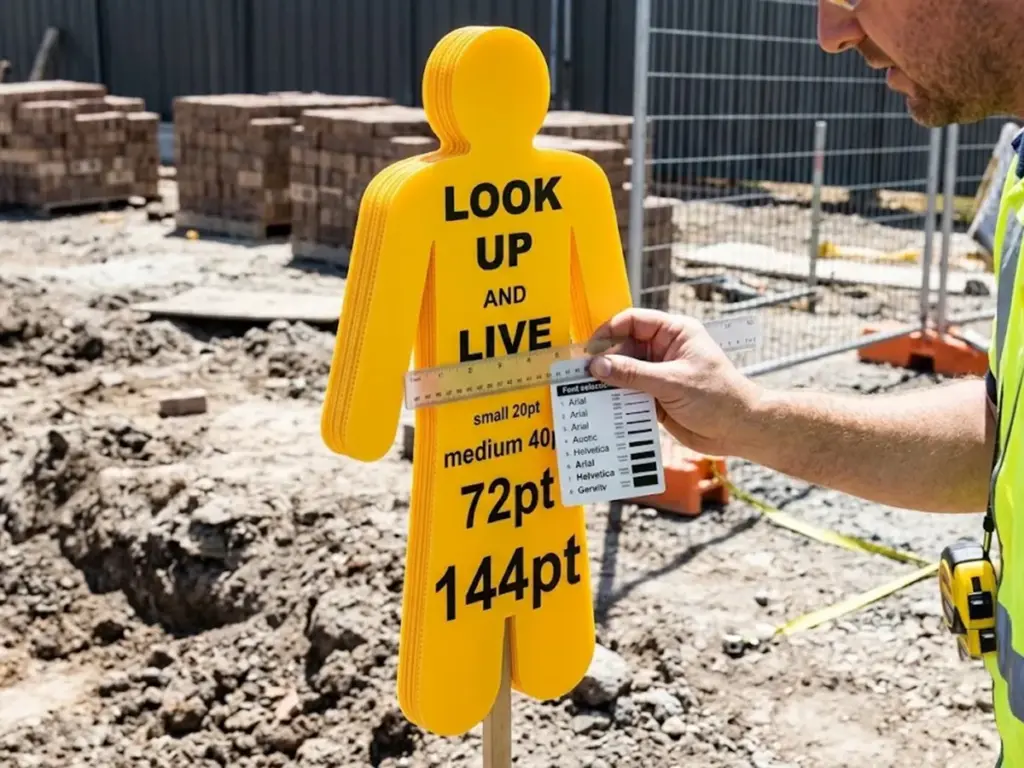
Выбор шрифта определяет, действительно ли вспомогательный текст будет прочитан.. Поймите это неправильно, и формулировка становится фоновым шумом на фоне сильного Желтый корфлейтовый дизайн знака человека.
Утвержденные стили шрифтов для максимальной разборчивости на дороге
Придерживайтесь жирного шрифта, шрифты без засечек. КАК 1319-1994 отсылает к стандартному алфавиту дорожных знаков, Серия б, В, Д или Е, согласно AS 1744. Сжатые или декоративные шрифты постоянно не проходят проверку разборчивости на расстоянии..
Расчет минимального размера шрифта по расстоянию просмотра
Требования к размеру шрифта временных знаков безопасности, которым должны следовать проектировщики из Австралии, четко изложены в AS. 1319-1994. Прописные буквы должны иметь высоту не менее 5 мм на метр расстояния просмотра.. Строчные буквы нужны 4 мм на метр., и пиктограмм нужно не менее 15мм на метр. Где освещение плохое, или знак находится за пределами прямой видимости, стандарт рекомендует увеличить размер пиктограмм и текста на 50%.
| Элемент | Правило минимального размера (КАК 1319-1994) | Плохая регулировка освещения |
| Текст в верхнем регистре | 5высота мм на метр расстояния просмотра | +50% |
| Текст в нижнем регистре | 4высота мм на метр расстояния просмотра | +50% |
| Пиктограмма/символ | 15мм на метр расстояния просмотра | +50% |
Источник: КАК 1319-1994, Знаки безопасности для производственной среды; обобщено в руководстве по соблюдению требований Seton Australia
КАК 1319-1994 Пункт 3.4 Математика соответствия & Примеры расчета
Чтобы ваш дизайн прошел аудит сайта, используйте следующие формулы для расчета абсолютных минимальных размеров макета на основе целевого расстояния просмотра. (Дюймовый, в метрах):
Минимальная высота текста в верхнем регистре (мм) = Д х 5
Минимальная высота значка (мм) = Д х 15
Давайте посмотрим, как эти правила применяются к двум распространенным сценариям размещения сайта.:
Сценарий А: Дневной свет с высокой видимостью (Расстояние просмотра: 15 метры)
Текст в верхнем регистре (НАПРИМЕР., “ИСКАТЬ”): 15 м х 5 мм/м= 75 минимальная высота буквы, мм.
Икона (Желтый силуэт рабочего): 15 м х 15 мм/м = 225 мм минимальная высота.
Сценарий Б: Затененный подмост или зона слабого освещения (Расстояние просмотра: 15 метры)
Потому что освещение плохое, КАК 1319-1994 Пункт 3.4(беременный) предписывает 50% увеличение размера:
Скорректированный текст в верхнем регистре: 75 мм x 1.5 = 112.5 х (Округлить до мм.).
Скорректированная пиктограмма: 225 мм x 1.5 = 337.5 мм (Округлить до 338 мм).
Распространенные ошибки в размере текста, которые не проходят проверку сайта
Уменьшенная формулировка, малый интервал между буквами, и низкоконтрастные наложения — три наиболее частые причины переделок.. Любой из них может отправить Желтый корфлейтовый дизайн знака человека вернемся к чертежной доске. Для более глубокого анализа наиболее эффективные шрифты и символы для этих знаков, см. наше специальное руководство по стандартам разборчивости.
Проектирование классики “СМОТРИТЕ И ЖИВИТЕ” Пользовательский макет знака
Индивидуальный поиск и дизайн живых вывесок заслуживают отдельного раздела.. Это один из наиболее востребованных вариантов среди офицеров безопасности Австралии, управляющих опасностями над головой..
Цель & Происхождение “Смотри вверх и живи” Обмен сообщениями
Это сообщение предупреждает рабочих и операторов предприятий об опасностях над головой., такие как линии электропередач, движение крана и строительные леса, где минутная невнимательность влечет за собой серьезные последствия. Операторы техники и водители уже имеют самый высокий уровень смертности среди всех профессиональных групп., в 6.7 перемещение 100,000 работники [1]. Эта цифра подчеркивает, почему указатели опасности над головой заслуживают такого внимания со стороны дизайнеров..
Структурирование иконки, Заголовок & Подтекст для предупреждений об опасности сверху
Ведите с пиктограммой, следовать с “СМОТРИТЕ И ЖИВИТЕ” заголовок жирным шрифтом. Затем добавьте ниже вспомогательную формулировку, специфичную для сайта.. Эта иерархия отражает более широкие принципы компоновки, рассмотренные ранее в этом руководстве..
Возможности настройки без ущерба для соответствия
Цветовые акценты, дополнительные зоны брендинга и подтекст, специфичный для сайта, могут быть добавлены без нарушения требований. Основная пиктограмма и коэффициенты контрастности должны оставаться нетронутыми..
Будучи полностью интегрированным, комплексный производитель дорожных знаков, Наша команда самостоятельно занимается точной высечкой и УФ-печатью непосредственно на подложке.. Пользовательские макеты, такие как “СМОТРИТЕ И ЖИВИТЕ” переход от концепции к готовому корфлейтовому знаку без задержек на аутсорсинг.
Создание готового к печати векторного файла для изготовления вывесок Corflute
Каждый законченный Желтый корфлейтовый дизайн знака человека начинает жизнь как файл. Правильное оформление этого файла экономит недели переговоров с производителем вывески., и именно это превращает соответствующий требованиям дизайн на экране в соответствующий знак на месте..
Вектор против растра: почему файлы, готовые к печати, должны быть масштабируемыми
Шаблон желтого знака рабочего в векторном файле легко масштабируется до любого размера доски без пикселизации.. Это важно, поскольку вывески из корфлюта производятся в масштабах, гораздо больших, чем макет экрана..
Настройка кровотечения, Безопасные зоны & Цветовые режимы для УФ-печати
Установите для изображения цветовой режим CMYK., применять постоянный допуск за обрез и держать текст и значки внутри определенной безопасной зоны. Это решения рабочего процесса, не характеристики подложки. Они применяются независимо от того, какой производитель печатает конечную плату..
Форматы файлов, принимаемые производителями знаков Австралии
Ай, EPS и готовый к печати PDF с контурными шрифтами остаются отраслевыми стандартами передачи документов.. Если ваша команда начинает с нуля, а не создает файл самостоятельно, а готовый к использованию шаблон для печати можно сократить весь этот шаг.
Настройка шаблонов без нарушения соответствия
Штатным дизайнерам регулярно предлагается сбалансировать корпоративный брендинг и AS. 1319-1994 правила разборчивости. Четкая грань между ними предотвращает как несоблюдение требований, так и несоответствие бренда.. Хороший Желтый корфлейтовый дизайн знака человека сочетает оба варианта, не принуждая к компромиссу.
Что можно настроить (Формулировка, Брендинг, Цветовые акценты)
Названия сайтов, логотипы компании в отведенных зонах, и вспомогательные формулировки могут быть скорректированы для каждого проекта, не затрагивая основной знак..
Что никогда нельзя менять (Геометрия основного символа & Контраст)
Геометрия рабочего силуэта, коэффициент контрастности черного на желтом и правила минимального размера, рассмотренные ранее, должны оставаться неизменными. Изменение любого из этих требований ставит под угрозу узнаваемость и может привести к несоблюдению требований государственных правил WHS, которые ссылаются на AS. 1319-1994.
Мультисайт & Согласованность парка — использование основных шаблонов
Единый утвержденный главный шаблон, заблокировано для основных элементов, но доступно для редактирования в определенных зонах, обеспечивает единообразие вывесок на всех рабочих площадках, где работает компания.
От файла проекта к физическому знаку — что происходит дальше
Раз в Желтый корфлейтовый дизайн знака человека файл заблокирован, разговор переходит от дизайнерского замысла к производственной реальности.
Конструктивные соображения, влияющие на режущую способность
Округлые углы, Расположение монтажных отверстий и зазор между краями необходимо учитывать на этапе проектирования., задолго до того, как доска достигнет лезвия.
Сделай сам или профессиональная высечка — когда каждое имеет смысл
Некоторые группы безопасности справляются с небольшими, небольшие объемы продаж внутри компании; Внедрение более крупных объектов или на нескольких объектах обычно происходит быстрее благодаря профессиональным услугам по высечке.. Для команд, изучающих первый вариант, а Пошаговое руководство по вырезанию вывески из корфлюта своими руками подробно описывает процесс.
Подготовка вашего файла к передаче производителю вывесок
Окончательный контрольный список дизайна — правильный цветовой режим, контурные шрифты, подтвержденное удаление и заблокированные основные элементы — предотвращает задержки после того, как файл достигнет рабочей версии. Сотрудники службы безопасности, которым нужен полный контекст этих решений, могут найти его в нашем Полное руководство по вырезанию знаков безопасности для работников для безопасности сайта, который охватывает более широкую категорию, к которой относится данное руководство по проектированию..
Окончательный контрольный список дизайна перед заказом или печатью
Последний проход проверки выявляет ошибки, которые требуют больше всего времени в дальнейшем.. Относитесь к этому контрольному списку как к последним воротам. Каждый Желтый корфлейтовый дизайн знака человека должен пройти через него, прежде чем попасть в очередь печати.
Разборчивость перед производством & Контрольный список соответствия
- Пиктограмма и текст имеют правильный размер для подтвержденного расстояния просмотра.
- Контраст черного на желтом проверен по AS 1319-1994
- Геометрия основного силуэта не изменена.
- Файл сохранен как векторный. (Ай, прибыль на акцию, или готовый к печати PDF-файл) с обрисованными шрифтами
- Обрезные и безопасные зоны подтверждены для УФ-печати
Распространенные ошибки дизайна, которые задерживают утверждение или перепечатку
Небольшой текст, растровые изображения, представленные вместо векторных файлов, и измененные пропорции силуэта являются постоянными виновниками перепечаток и задержек с утверждением..
Когда следует привлекать профессионального производителя вывесок для сложных макетов
Планы с несколькими опасностями, Внедрение фирменной продукции на нескольких площадках или что-либо выходящее за рамки одной стандартной платы получит выгоду от профессионального вклада на раннем этапе.
Если ваша планировка предполагает несколько типов опасностей, индивидуальный брендинг или развертывание на нескольких сайтах, наши собственные возможности дизайна и печати могут превратить ваш файл от концепции до готового корфлейтового знака без необходимости привлекать аутсорсинг..
Часто задаваемые вопросы
Каков минимальный размер шрифта для желтого корфлейтового знака безопасности человека по стандартам Австралии??
Под АС 1319-1994 Пункт 3.4, минимальный размер прямо пропорционален расстоянию просмотра: Для текста в верхнем регистре требуется не менее 5 мм на метр расстояния просмотра., в нижнем регистре требуется 4 мм на метр, и пиктограммы безопасности требуют 15 мм на метр.. Для вывесок, размещенных в плохо освещенных или менее заметных местах., Пункт 3.4(беременный) предписывает 50% увеличение размера (множитель масштабирования 1,5x) для поддержания критической видимости.
Могу ли я настроить формулировку на “Смотри вверх и живи” подпишитесь на мой сайт?
Да. Формулировка, специфичная для сайта, цветовые акценты и зоны брендинга могут быть настроены индивидуально, предоставил основную пиктограмму, Правила коэффициента контрастности и размера букв соответствуют стандарту AS 1319-1994.
Какой формат файла мне следует использовать при отправке моего дизайна производителю вывесок??
Векторные форматы — AI, EPS или PDF-файл, готовый к печати, с контурными шрифтами — отраслевой стандарт.. Растровые файлы, например JPEG или PNG, имеют тенденцию к пикселизации после масштабирования до полного размера знака, и этого следует избегать при передаче.
Нужен ли мне дизайнер, чтобы создать соответствующий желтый знак рабочего?, или можно использовать шаблон?
Хорошо построенный шаблон желтого рабочего знака для печати может удовлетворить AS 1319-1994 требования при правильном соблюдении принципов читаемости и компоновки. Наше загружаемое руководство по шаблонам представляет собой готовую отправную точку для команд, не имеющих собственных ресурсов дизайна..
В чем разница между разработкой вывески для самостоятельной резки и профессиональной высечкой?
Для файлов, готовых к самостоятельной обработке, обычно требуются более простые линии разреза и большие угловые радиусы., в то время как профессиональная высечка позволяет обрабатывать более жесткие допуски и более сложные формы.. В нашем пошаговом руководстве «Сделай сам» описан весь процесс резки корфлейтовых вывесок на месте..
Ссылки
- Безопасная работа Австралия, Основная статистика по охране труда и технике безопасности Австралии 2025
- Стандарты Австралия (через интернет-магазин ANSI), КАК 1319-1994 (Р2018) — Знаки безопасности для производственной среды