Traffic signs are very important for keeping drivers safe. The размер дорожного знака and the symbols on signs help people get key information fast. This helps stop mistakes. Research shows unclear signs cause many accidents:
- Вокруг 40% of car crashes happen because road sign size is not good enough.
- О 30% of wrong-way crashes happen when signs are missing or hard to see.
The size of a road sign and its symbols affects how easy it is to see and read. It also helps meet safety rules. Making symbols the right size in relation to road sign size helps every driver get clear directions quickly and correctly.
Ключевые выводы
- The right road sign size and symbol dimensions help drivers stay safe. They make signs easier to see and understand.
- Large signs and symbols are important on highways. They give drivers more time to notice and react.
- Designers need to use rules for symbol and font sizes. This helps make signs clear, Особенно для пожилых водителей.
- Strong contrast between symbols and backgrounds makes signs easier to read in bad weather.
- Simple shapes and clear fonts help people read road signs. Это снижает вероятность несчастных случаев.
Road Sign Size and Symbol Proportion
Proportional Scaling of Road Sign Symbols
Designers use proportional scaling to keep symbols clear. The symbols get bigger when the sign gets bigger. This helps drivers see and understand signs.
- The sign size should fit how far away drivers are.
- Big signs help drivers see them from far away on highways.
- Small signs work better for close-up places like city streets.
- На каждый 10 в ногах, letters should be at least 1 inch tall.
Сюда, signs look the same and are easy to read. Making symbols the right size helps people read and understand signs. This is important for safety.
Viewing Distance and Placement
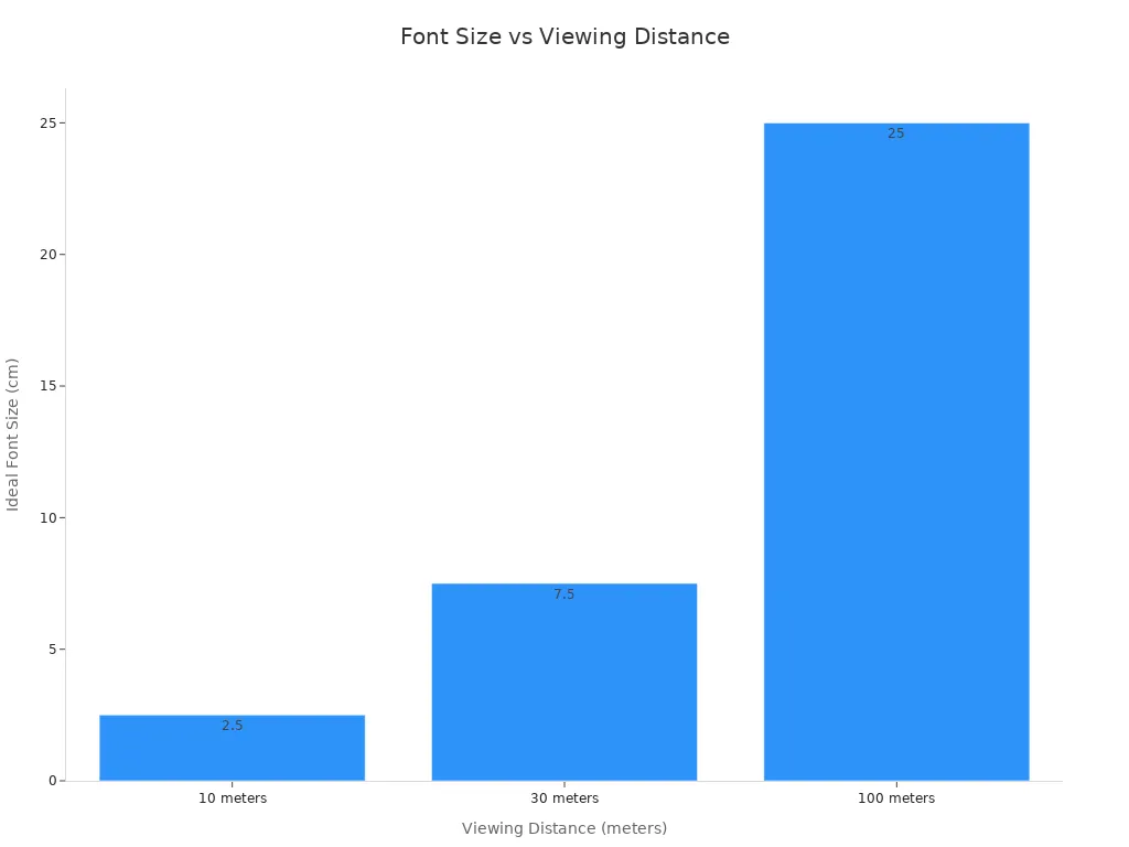
How far away drivers are matters for sign design. Designers think about when drivers first see the sign. The table below shows how sign height and font size change with distance:
| Viewing Distance Minimum | Знак высоты | Ideal Font Size (Высота) |
|---|---|---|
| 10 метры | 30–45 cm (1–1.5 ft) | 2.5 см (1 дюйм) |
| 30 метры | 90–120 cm (3–4 ft) | 7.5–10 cm (3–4 inches) |
| 100 метры | 200 см (6.5–8 ft) | 25 см (10 дюймы) |
Where the sign goes also helps people see it. The table below lists ways to make symbols work better:
| Стратегия | Описание |
|---|---|
| Знак знака | Make sure the sign is big enough and fits in its spot. |
| Lighting Techniques | Use lights or screens to help people see the sign in the dark. |
| Positioning Angles | Put the sign at the right angle and height so drivers can read it. |
| Graphic Hierarchy | Use size, цвет, and font styles to show what is most important. |
Highway signs need bigger symbols and fonts. Это дает водителям больше времени для реагирования. Good placement and scaling make signs work better and stop confusion.
Human Perception and Symbol Legibility
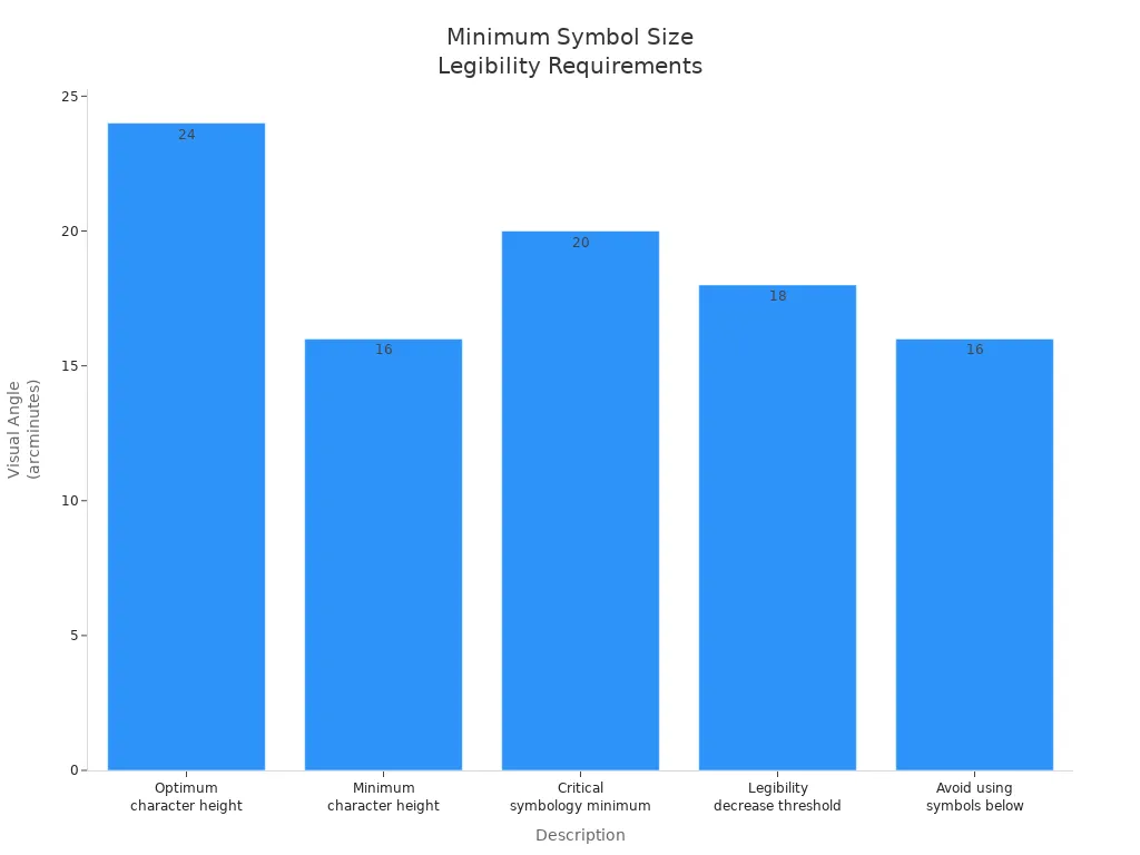
People can only read symbols if they are big enough. Studies show the visual angle makes a difference. If symbols are too small, people cannot read them well. The table below shows the smallest symbol sizes people can read:
| Описание | Visual Angle (arcminutes) |
|---|---|
| Optimum character height | 24 |
| Minimum character height | 16 |
| Critical symbology minimum | 20 |
| Legibility decrease threshold | 18 |
| Avoid using symbols below | 16 |
The difference between the symbol and the background matters too. High contrast helps people read signs in bad weather or at night. Designers pick the right font and symbol size for each sign. Это помогает всем водителям, no matter their age or eyesight, understand signs fast. Good symbol design makes roads safer for everyone.
Symbol Size, Размер шрифта, and Road Safety
Impact on Driver Reaction and Comprehension
The size of symbols on road signs affects how fast drivers react. Bigger and clearer symbols help drivers make choices quickly. Studies show that how information looks on signs changes how fast people react and understand. The table below shows how different sign types affect drivers:
| Display Condition | Время реакции | Comprehension Rate |
|---|---|---|
| Text-only | Shortest | Самый высокий |
| Symbol with text | Умеренный | Умеренный |
| Symbol-only | Longest | Самый низкий |
Text-only signs let drivers react the fastest and understand best. But many drivers need symbols, especially where people speak many languages. Symbols on road signs must be big enough for everyone to read and understand. Good symbol design helps drivers get information fast, что делает дороги безопаснее. Highway signs often use both words and symbols to help drivers react quickly and understand. Designers need to think about both symbol size and font size to make signs work well.
Environmental Factors Affecting Legibility
Weather and lighting can make it hard to see road signs. Туман, дождь, and darkness can make symbols hard to read. Research says yellow text is easiest to see in light fog. Spacing between words also matters when the weather is bad. To help drivers see symbols in bad weather, Дизайнеры должны:
- Use bigger signs with bold fonts and colors that stand out.
A strong difference between the symbol and background makes signs easier to read. High contrast helps drivers see signs at night or in storms. Signs with the right font and symbol size are easier to spot in tough weather. These changes help keep drivers safe and help them understand signs, Даже когда погода плохая.
Standards and Guidelines for Road Sign Symbols
Rules help designers make road sign symbols and fonts the right way. Руководство по однородным устройствам управления движением (Mutcd) and other rules say how big symbols and letters should be and what colors to use. The table below lists some main rules:
| Тип требования | Подробности |
|---|---|
| Symbol Size | Symbols should be bigger than the smallest allowed size for better reading. Shapes and colors must stay the same. |
| Lettering Size | Main words on guide signs should be at least 150 мм (6 в) for big letters or 150 мм (6 в) for big letters and 113 мм (4.5 в) for small letters. |
| General Information Signs | White words and borders on green backgrounds; size should change if there are more words. |
- Letter sizes should be the same for each highway type.
- Use bigger letters than the minimum size if it helps people read better.
Following these rules makes roads safer. Making signs meet these rules can lower crashes and help people understand signs. The number and where signs are placed also matter for safety. Designers must follow these rules so that road sign size, symbol size, and font choices help all drivers stay safe and understand signs.
Determining the Right Symbol and Font Size
Calculation Methods and Industry Formulas
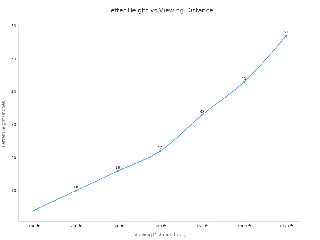
Designers use easy formulas to pick symbol and font size. The main rule is to make letters 1 inch taller for every 10 feet you need to see. This matches letter height with how far away drivers are. Например, if a sign must be read from 100 ноги, Письма должны быть 10 дюймы в высоту. The table below shows how tall letters should be for different distances:
| Минимальная высота буквы | Максимальное расстояние просмотра |
|---|---|
| 4 дюймы | 100 ноги |
| 10 дюймы | 250 ноги |
| 16 дюймы | 360 ноги |
| 22 дюймы | 500 ноги |
| 33 дюймы | 750 ноги |
| 43 дюймы | 1000 ноги |
| 57 дюймы | 1320 ноги (1/4 миля) |
Designers use tables to match speed with font and symbol size. This helps all drivers see and understand signs.
Differences by Road Type and Sign Use
Sign size changes based on speed and place. Highway signs need bigger symbols and fonts because cars go faster. Drivers have less time to see and react. The table below shows sign size for different speeds:
| Ограничение скорости (миль в час) | Рекомендуемый размер знака (дюймы) |
|---|---|
| 25 – 40 | 36 |
| 45 – 55 | 48 |
| Автострады | 60 или больше |
| Multi-lane roads | 48 |
| Low-speed streets | 30 (36 является общим) |
City signs use smaller symbols. Highway signs use bigger ones so drivers can see them better. Designers check font rules and change signs for each place to keep roads safe.
Balancing Aesthetics and Functionality
Designers think about how far drivers are from the sign. If the sign is far away, the font and symbols must be bigger.
Good symbol design means signs look nice and work well. Designers pick colors, Чистые шрифты, and layouts that help people read signs. Signs that look good help drivers pay attention and understand symbols. Using the same design helps drivers know signs fast, который обеспечивает безопасность всех.
Real-World Examples and Best Practices
Маленький против. Large Road Sign Size Comparison
Designers look at both small and large road sign symbols. They do this to see how size changes how easy signs are to read and understand. Small signs are good for quiet streets where cars go slow. Large signs are better for highways because cars go fast and drivers need more time to see and react. The table below shows how different signs use size to help drivers:
| Тип знака | Стандартный размер | Цель |
|---|---|---|
| Гидные знаки | 36 дюймы мимо 48 inches or larger | Makes sure drivers can see important directions on highways. |
| Предупреждающие знаки | 36 дюймы мимо 36 дюймы | Bigger signs help when it is hard to see, like on sharp curves. |
| Стоп знаки | Correctly sized | Lets drivers see the sign sooner, which helps at high speeds. |
| Шоссе знаки | Большие размеры | Gives clear directions early so drivers do not get confused and stay safe. |
Big roadside signage helps drivers see and understand symbols from far away. Small signs can make drivers turn or stop suddenly, что может вызвать сбои.
Case Studies in Urban and Highway Settings
В городах, signs are smaller and use clear font and simple symbols. These signs help drivers who are not going fast. На шоссе, signs are bigger and use bold font and large symbols. This gives drivers more time to read and make safe choices. Many highway projects make signs bigger to help people read them and avoid mistakes. Когда знаки имеют правильный размер, drivers can react in time, Даже при быстром вождении.
Key Takeaways for Symbol Legibility
Good symbol design helps all drivers understand signs, even older adults who may have trouble reading them.
Best ways to make road sign symbols are:
- Use simple shapes and solid pictures.
- Leave enough space between parts.
- Pick clear font styles.
- Do not use hard-to-understand images.
The table below shows what studies found about reading symbols and understanding them:
| Тип доказательств | Выводы |
|---|---|
| Понимание | Older drivers do not understand symbol signs as well as younger drivers. |
| Расстояние разборчивости | Older drivers cannot read signs from as far away, so they have less time to react. |
| Design Guidelines | Rules say to keep symbols simple, leave space, and use solid shapes. |
Doing these things makes roadside signage work better and keeps everyone safer on the road.
Making symbols and fonts the right size on road signs helps keep drivers safe. It also helps drivers understand signs better. Research shows clear signs can lower deaths by up to 87%. Clear signs also save money when roads get fixed.
- Designers need to make sure symbols and fonts fit the sign size and how far away drivers are.
- Makers have to use the right height for letters and make sure there is enough contrast.
Experts say using both big and small letters and making letters bigger helps people read signs better, Особенно пожилые водители.
Часто задаваемые вопросы
What determines the best symbol size for a road sign?
Designers consider viewing distance, скорость дороги, and sign placement. They use industry formulas to match symbol size with how far drivers must read the sign. This ensures symbols stay clear and easy to understand.
Why does font size matter on road signs?
Font size affects how quickly drivers can read information. Большой, clear font helps drivers see words from a distance. Это уменьшает ошибки и повышает безопасность, especially on highways where vehicles move fast.
How do weather and lighting affect road sign legibility?
Дождь, туман, и темнота может сделать знаки трудноразличимыми. Designers use high-contrast colors and larger symbols to help drivers read signs in poor conditions. Good font choices also improve visibility during bad weather.
Are there rules for road sign symbol and font sizes?
Руководство по однородным устройствам управления движением (Mutcd) gives clear rules for symbol and font sizes. Designers must follow these standards to keep roads safe and signs easy to read.
Can the same sign design work for both city streets and highways?
Нет. City streets use smaller signs and symbols because cars move slower. Highways need larger signs, bigger symbols, and larger font so drivers have more time to react.
