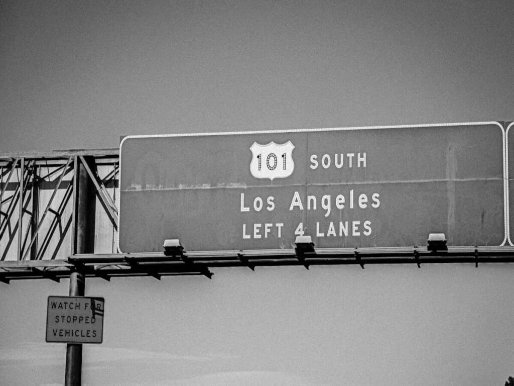
Have you ever noticed that highway sign fonts vary across different locations? In the United States, two primary fonts are used: Highway Gothic and Clearview. The choice of font on highway signs plays a crucial role in how quickly drivers can read and process important information. Research shows that larger letters and high contrast improve visibility, enabling drivers to spot signs faster and enhancing overall road safety. Even seemingly small decisions, like selecting the right highway sign font, can make journeys smoother and help reduce sudden stops or accidents.
At OPTRAFFIC, we understand the importance of clear, readable highway signs for driver safety. That’s why we offer a wide range of high-quality traffic signs, including customizable highway signs that meet the latest standards for readability and visibility. Whether you need Clearview or Highway Gothic fonts, we provide solutions that ensure maximum clarity and compliance, helping road users navigate with ease and confidence.
Highway Sign Fonts Origin
Postwar Standardization
After World War II, more people started driving in the United States. Roads got longer, and families traveled farther than before. The government wanted every driver to read signs quickly and easily. In 1948, the Federal Highway Administration made a new font called highway gothic. This font was added to the Standard Alphabets for Traffic Control Devices. The main goal was to make signs clear and easy to read. This helped keep drivers safe.
The Federal Highway Administration helped set rules for highway sign fonts. Their work changed over the years:
| Year | Development |
|---|---|
| 1948 | First release of the Standard Alphabets for Traffic Control Devices. |
| 1958 | AASHTO made a manual for Interstate Highways with mixed-case legend. |
| 2004 | FHWA added lowercase letters for all typefaces and updated the Manual on Uniform Traffic Control Devices. |
| 2016 | FHWA stopped approval of Clearview and kept Highway Gothic for new signs. |
Why Highway Gothic Was Chosen
You may wonder why highway gothic became the main font. The reason is simple. The font was made so drivers could read it fast. It worked well on signs of different sizes and with many word lengths. Each letter looks different from the others. There are not many thick or thin lines, so words are easier to see. Big spaces between letters and open shapes help your eyes find words quickly.
- Made for easy reading at high speeds
- Used in all states for consistency
- Fits many sign sizes and word lengths
- Letters look different from each other
- Few thick-to-thin changes in lines
- Lots of space between letters and open shapes
Early Adoption and Impact
When highway gothic showed up on signs in the 1950s, drivers could read directions much better. The font became the most common style for road signs everywhere. This change helped drivers react faster and made roads safer. Over time, experts saw that rain or nighttime made the font harder to read for some people. These problems led to new ideas for better signs, but highway gothic stayed the main font for many years.
Clearview and the Need for Different Fonts
Limitations of Highway Gothic
Highway gothic was used for a long time, but it did not fix every problem. As people get older, their eyes change. It gets harder to read signs at night. Research shows highway gothic is tough for older drivers to read, especially after dark. Older drivers have trouble seeing the letters clearly. Their eyes do not handle low contrast well. Sometimes, a glow appears around the letters. This makes the words even harder to see. Experts wanted to find a better answer.
Tip: Many drivers have trouble reading signs at night. This happens more as people get older.
Clearview’s Design Improvements
Designers made a new font called Clearview to help drivers. Clearview has bigger spaces inside the letters. It also has taller lowercase letters. These changes make words easier to see from far away and under headlights. Clearview helps cut down the glow that can blur letters at night. You can look at the table below to see how Clearview and highway gothic compare:
| Feature | Clearview-Bold | Standard Alphabet Series E (modified) |
|---|---|---|
| Nighttime Reading Distance | Improved by up to 16% | Baseline |
| Additional Reading Time | 1.2 seconds more | Baseline |
| Recognition Time | 1.3 seconds earlier | Baseline |
Clearview gives older drivers more time to read signs. It helps everyone see words faster. Designers also needed the font to work for long distances and many languages. This is not always easy.
- Older drivers need fonts with strong contrast.
- Clearview helps with glow from headlights.
- The font is good for reading from far away.
Federal Approval and Testing
The government wanted to check if Clearview really helped. A team of engineers and psychologists tested the font in real driving situations. They found Clearview was easier to read and recognize than highway gothic by 20%. Six studies and many field tests proved these results.
| Evidence Description | Details |
|---|---|
| Improved Legibility | Clearview is 20% easier to read and recognize than highway gothic. |
| Development Team | Engineers, psychologists, and designers worked together to make Clearview. |
| Studies Conducted | Six studies and many field tests checked how well the font worked for drivers. |
The Federal Highway Administration approved Clearview for highway signs in the early 2000s. This let states use different fonts to help all drivers stay safe and read signs better.
Comparing Different Fonts on US Highways
Readability and Visual Differences
When you look at highway sign fonts, you can see they are not the same. Highway Gothic puts letters close together, especially in vowels like ‘a’, ‘e’, and ‘u’. This makes words harder to read fast when you are driving. Clearview has more space between the lines in each letter. The lowercase letters are taller, and the gaps between letters are bigger. These changes help you spot words faster, even at night or from far away.
Clearview is 20 percent easier to read than Highway Gothic. Designers changed some lowercase letters, like ‘e’, ‘o’, and ‘s’, to stop the glow from headlights. This makes signs easier to see when it is dark. Older drivers find these changes helpful. They can read signs without needing bigger letters or bigger signs.
| Feature | Highway Gothic | Clearview |
|---|---|---|
| Letter Spacing | Tight | Wider |
| Lowercase Letter Size | Standard | Taller |
| Nighttime Visibility | More halation | Less halation |
| Readability | Baseline | 20% improvement |
Tip: Clearview’s design lets you read signs faster and with less work, especially at night.
State-by-State Usage
You might see different highway sign fonts on signs when you travel to other states. Texas uses both Highway Gothic and Clearview. For over ten years, Clearview was used on Texas signs to help people read them better. The Texas Department of Transportation likes Clearview because it makes words easier to see. TxDOT wants to keep using Clearview, but new signs now use Highway Gothic. Old Clearview signs stay up until they need to be replaced.
Other states also have to pick which font to use. Some states use only Highway Gothic for new signs. Others use Clearview in places where older drivers need extra help. Changing all the signs takes a long time and costs a lot. That is why you see both fonts on highways as states update their signs.
- Texas uses both highway sign fonts, but new signs use Highway Gothic.
- Old Clearview signs stay until they wear out.
- TxDOT likes Clearview because it is safer.
- States choose the font that works best for their drivers.
Safety and Practical Impact
The font on highway signs changes how fast you react when driving. If you read signs faster, you make safer choices. Experts found that Clearview makes you look at signs for less time. This means you spend more time watching the road. Humanist fonts like Clearview are easier to read, especially when you only have a second to look.
“Picking one font over another made people look at signs for 10.6% less time. Men finished tasks faster and needed fewer glances with the humanist font.”
Studies show that confusing signs can cause more crashes. For example, showing crash numbers on electronic signs in Texas made accidents go up by 4.5%. Drivers spent more time reading, so they reacted slower. The study said there were about 2,600 more crashes and 16 more deaths each year. This cost $377 million. This shows why it is important for sign fonts to be easy to read and not confusing.
Other countries use sans serif fonts for road signs too. Australia and the UK say clear, bold fonts are safest. Research shows sans serif fonts like Arial help you read signs faster and understand directions better, especially when driving fast.
Note: In 1966, the Manual on Uniform Traffic Control Devices made Highway Gothic the standard. Studies say making Highway Gothic letters 20 percent bigger helps people read them much better.
When you drive, the font on the sign helps you find your way and stay safe. States keep testing fonts to see which one is best for their roads and drivers.
The Debate and Future of Highway Sign Fonts
Public Opinion and Research
People have different ideas about which font is best. Some drivers think Clearview is easier to read, especially in Texas. Other people like Highway Gothic because it has been used for a long time. Experts keep studying both highway sign fonts to see which works better.
“A study from MIT and Texas A&M says Clearview is easier to read. This is true no matter what colors are used. The study says Clearview is easy to read because of how it is made, not because of outside things.”
Many studies look at how well people can read each font. The table below shows what researchers found:
| Study | Findings |
|---|---|
| LTI (Garvey, et al. 1997) | Clearview’s bold mixed-case letters were easier to read on freeway signs than all uppercase letters. |
| Texas A&M Transportation Institute (1996-2001) | Five studies said Clearview was better than federal rules, especially for older drivers. |
| T.D. Larson Transportation Institute (2002) | People liked Clearview more during tests compared to FHWA standards. |
Some studies did not agree with Clearview’s claims. Sometimes, new sign materials helped more than the font. In some cases, Clearview made signs harder to read, especially with dark letters on a white background.
Technological Advances
New technology changes how highway sign fonts are made. Reflective signs made designers think about how easy signs are to read. Clearview was made to help people see signs better at night. Now, digital signs are used on highways. New fonts like Interstate were made for these screens. You see more electronic signs now, so designers keep testing which fonts work best.
- Clearview made signs 2-8% easier to read than older fonts.
- People still argue about which font is best as technology changes.
- Digital signs bring new problems for font design.
What’s Next for Highway Fonts
You might wonder what will happen with highway sign fonts. Some experts say new materials and digital signs will change how you read signs. States want fonts that help all drivers, even older people. Designers may make new fonts for smart roads and self-driving cars. The argument between Clearview and Highway Gothic will keep going as technology and research change.
- Highway sign fonts could change with new technology.
- States will keep checking which font is safest.
- Both fonts will be on highways for many years.
You see two fonts on US highway signs. Designers and lawmakers want you to read signs fast and stay safe. Highway Gothic and Clearview both help drivers. Rules and money make both fonts stay on signs. The table below shows how government choices changed which fonts states use:
| Date | Event |
|---|---|
| September 2, 2004 | Clearview got temporary approval for positive-contrast road signs. |
| January 25, 2016 | FHWA said it would take away temporary approval for Clearview. |
| March 28, 2018 | Congress told FHWA to give back temporary approval for Clearview. |
Next time you drive, look at the signs. Think about how font design affects your trip. Will new technology change how you read signs one day? 🚗
FAQ
Why do some highway signs look different in different states?
You may notice different highway sign fonts because each state decides which font to use. Some states use Highway Gothic, while others use Clearview. Old signs often stay up until they wear out, so you see both fonts during your travels.
Is one font safer than the other?
Studies show Clearview helps you read signs faster, especially at night or if you are older. Highway Gothic still works well for many drivers. Both fonts aim to keep you safe by making signs easy to read.
Can you tell which font a sign uses just by looking?
You can spot the difference if you look closely. Clearview letters look wider and have more space between them. Highway Gothic letters appear tighter and shorter. Try comparing the lowercase “e” or “a” next time you drive.
Will all signs switch to one font in the future?
Most states keep both highway sign fonts for now. Changing every sign costs a lot of money and takes time. New technology may bring new fonts or digital signs, so you might see even more changes ahead.
