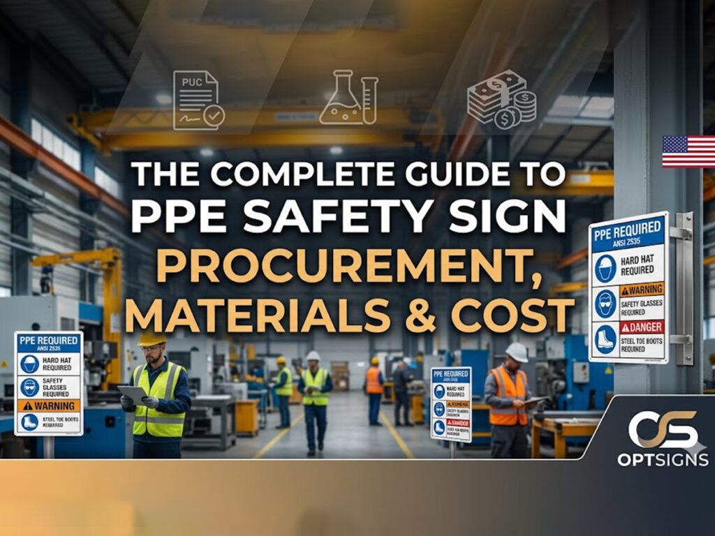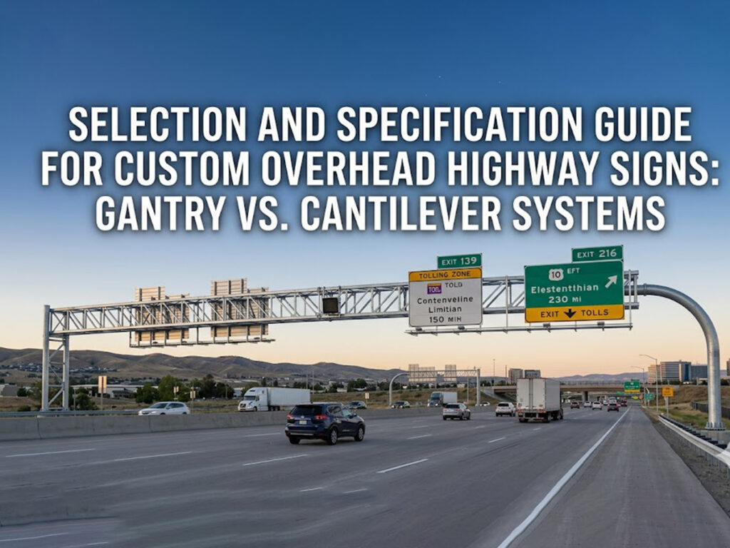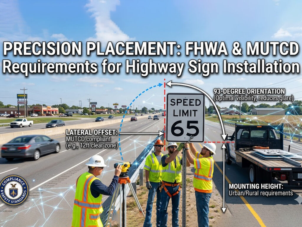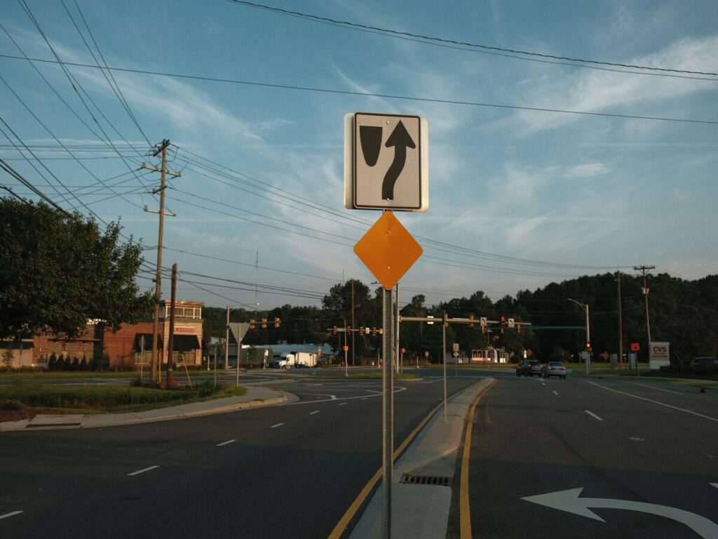
You need clear and compliant signage to keep people safe and your site organised. Custom traffic signs play a vital role on private roads, construction sites, car parks, and within gated communities. These signs help communicate hazards, emergency instructions, and directional guidance to both drivers and pedestrians.
By reducing confusion and lowering the risk of accidents, well-designed custom road signs improve both site safety and operational flow. Directional signage is especially useful for managing vehicle movement and preventing traffic congestion.
Australian Standards such as AS 1742 and AS 1319 ensure your signs meet legal and safety requirements. Using reflective sheeting and durable materials further enhances visibility and lifespan—essential for high-traffic or low-light environments.
At OPTRAFFIC, we provide high-quality custom traffic signs tailored to your specific needs—ensuring compliance, clarity, and long-term performance across all site types.
Purpose
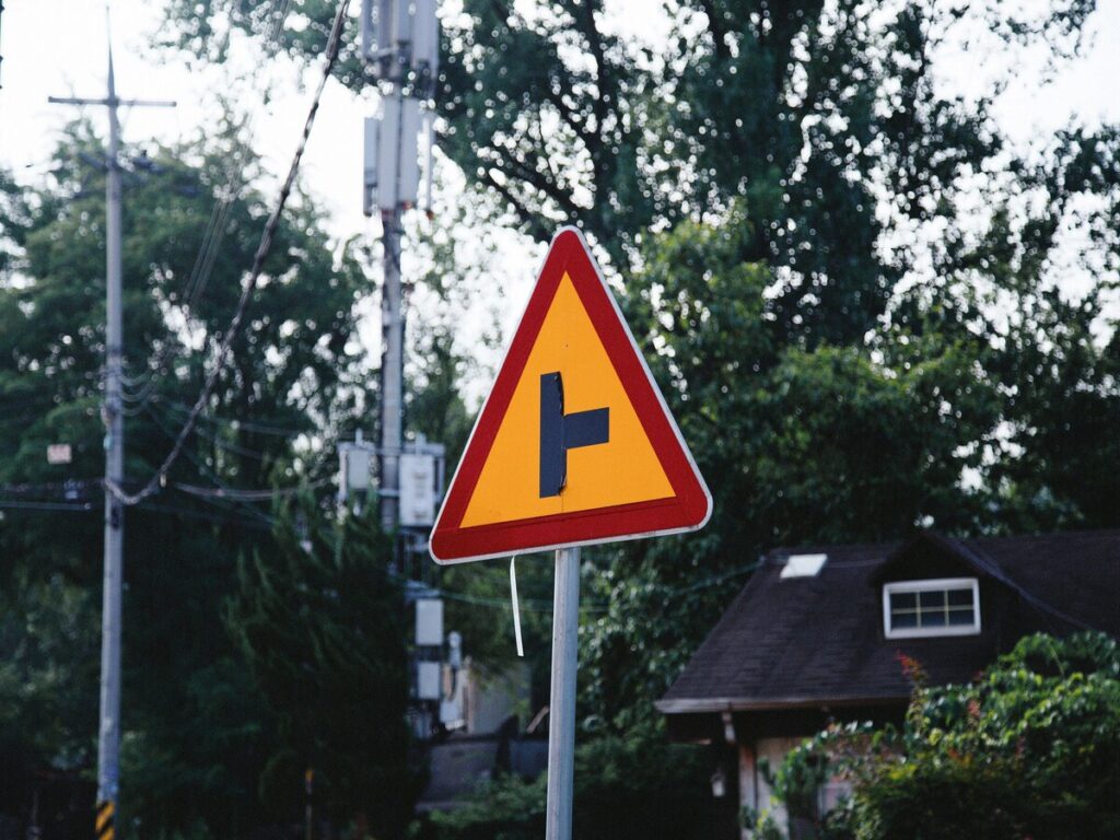
Identify Needs
You must start by understanding why you need new signage. Every sign has a job. Some signs inform, like showing directions or giving instructions. Others warn about dangers, restrict access, or guide people safely. For example, you might need a sign that says “No Trucks Beyond This Point” to keep heavy vehicles away from quiet streets. In a business car park, “Authorised Parking Only” helps control who can use certain spaces.
Customisation plays a big role in making sure your signs fit your site. You should look at the physical space and check how visible the sign will be. Site surveys help you measure where to place signs, how big they should be, and what might block them. Studies show that most people only notice signs for a few seconds, so you need to make every moment count. The 20-10-5 foot test helps you check if your message is clear from different distances. Local rules and permits also shape your custom sign design, so always check these before you start.
Tip: Clear purpose in custom traffic signs can improve safety. In one study, a new pedestrian crossing sign made more drivers yield and helped more people feel safe.
Define Audience
Think about who will see your signage. Drivers, pedestrians, workers, and visitors all have different needs. Drivers need clear, quick messages because they move fast. Pedestrians need signs at eye level with simple words. Workers on a construction site may need safety instructions, while visitors might look for directions.
Customisation lets you match the sign to your audience. For example, a school zone needs signs that alert both drivers and children. In a warehouse, you might need signs that warn about noise or moving vehicles. Analysing traffic patterns and customer habits helps you place signs where people will see them. Good signage speaks directly to its audience and keeps everyone safe.
Types of Custom Traffic Signs

When you make custom traffic signs, you need to know the main types. Each type has a different job and helps people stay safe and know what to do. You can pick from regulatory, warning, and information signs. Good customisation makes sure your signs fit your site.
Regulatory Signs
Regulatory signs tell people what they must do or not do. You see these signs every day, like speed limits, no entry, or stop signs. These signs use clear shapes and colours so drivers and people walking can understand the rules fast. Studies show that regulatory signs help people follow rules and lower accidents. For example, bright, reflective signs help people see them at night from 90 metres to over 300 metres. LED signs in school zones made more drivers follow speed rules, going from 66% to 87% in three months. You should always use reflective materials for these signs to help people see them in low light.
| Regulatory Sign Example | Measured Effect | Source |
|---|---|---|
| LED school zone sign | Speed compliance up 21% | NSW Government |
Warning Signs
Warning signs tell you about dangers ahead. You might see signs for sharp turns, slippery roads, or roadworks. These signs use yellow or orange backgrounds and bold symbols. Research shows that putting warning signs in the right place with distance information helps drivers pay attention and lowers accidents. But too many warning signs can make people tired, so you should only use up to three in a row. Reflective sheeting helps drivers see these signs at night or in bad weather, making things safer for everyone.
Tip: Put warning signs before dangers and add distance markers to help drivers react better.
Information Signs
Information signs help you find your way and know where you are. These signs give directions, parking rules, and help people in busy places. Clear information signs stop confusion and help people decide fast. Studies show that clear and familiar signs help people follow rules and act better, especially in busy areas. Good placement at places where people need to choose, like junctions or car park entrances, makes it easier to get around. You can use non-reflective or reflective materials depending on where the sign is and how easy it needs to be to see.
Custom traffic signs need the right mix of regulatory, warning, and information signs. You should always think about how easy the sign is to see, where it goes, and what your audience needs when you pick materials and designs.
Compliance
Standards
You must follow strict standards when you design signs. In Australia, AS 1742 and AS 1319 set the rules for traffic and safety signage. These standards tell you which colours, shapes, fonts, and sizes you need for each type of sign. For example, a stop sign must be red and shaped like an octagon. Warning signs use yellow or orange backgrounds with black symbols. Information signs often use blue or green backgrounds. These colours help people understand the message quickly.
You should use the right font for your signs. Standards recommend clear fonts like Transport or Helvetica. These fonts make words easy to read from a distance. The size of the letters depends on how far away people will see the sign. Bigger letters help with visibility on fast roads. Smaller letters work for signs in car parks or walkways.
You must also think about the material. Reflective sheeting helps drivers see signs at night or in bad weather. Class 1 reflective sheeting gives the best visibility. Class 2 works well for less busy areas. Always check the standards before you order or install new signage.
Note: Using the correct standards keeps your signage legal and easy to understand. This helps everyone stay safe.
Design Rules
You need to follow design rules to make sure your signs do their job. Good design helps people see, read, and follow the message. You should use high contrast between the background and the text. For example, black letters on a white or yellow background stand out. Avoid using fancy fonts or too many words. Simple messages work best.
You must place signs where people can see them easily. Do not hide them behind trees or other objects. The height and angle matter too. Signs should face the road or path so people see them as they approach. If you use reflective materials, check that car headlights will light up the sign at night.
Proper design also means following the law. If you use non-compliant styles, you risk fines or legal problems. Simulation studies show that when drivers follow well-designed signs, traffic moves better and accidents drop. In work zones, clear merging signs help drivers react early. This reduces late merges and keeps everyone safer. When you use the right design rules, you help people follow the law and improve safety for all.
You should never copy styles from other countries unless they match Australian standards. Always check the rules before you make or buy new signage. This keeps your custom traffic signs safe, legal, and effective.
Design and Materials
Readability
You want your signs to be easy to read at a glance. Good custom sign design uses high contrast colours, clear fonts, and simple words. When you choose colours, pick combinations like black on yellow or white on green. These stand out and help people see your signage from far away.
- Sans-serif fonts work best for large headings because they are simple and bold.
- Use different font sizes and weights to guide the eye and show what is most important.
- Keep your message short. Too many words make signs hard to read quickly.
- Make sure there is enough space between letters and lines. This helps each word stand out.
- Test your signs in different lighting and from different distances to check clarity.
Tip: Studies show that high contrast and clear fonts help people read signs faster and with fewer mistakes. Field tests confirm that good readability reduces confusion and keeps everyone safer.
You should always put clarity first. Avoid fancy or thin fonts. Simple designs help everyone understand your signage, even in busy or low-light areas.
Durability
Your signs need to last through sun, rain, and wind. Aluminium composite panels (ACM) are a top choice for permanent signage. They have special coatings that stop fading and protect against UV rays. ACM does not warp or rust, so your signs stay strong for years. Polycarbonate is another option. It resists impacts and works well for temporary signs, but it can turn yellow and brittle if left outside for too long.
- Use Class 1 reflective sheeting for the best visibility at night or in poor weather.
- Class 2 reflective sheeting works well for less busy places.
- Clean your signs with soft cloths to keep them bright and easy to see.
- Check your signage often, especially in harsh weather or high-traffic spots.
Note: Research shows that high-grade reflective signs can stay bright for 7 to 12 years. Regular cleaning and checks help keep your signage safe and clear.
Choose materials and finishes that match your needs. Good durability means your signs keep their message clear and their visibility high, year after year.
Branding and Identity
Logos and Colours
You can put your company logo and brand colours on signs. This helps people know your business and trust it. When you add logos or colours, check the rules first. The logo should not hide any important words or symbols. Use your brand colours, but make sure the sign is easy to read. For example, a blue logo on white is easy to see. A dark logo on a dark background is hard to read.
Tip: Put your logo in a corner or at the bottom. This keeps the main message clear and easy to spot.
Customisation lets you show your brand and keep signs safe. You must balance branding with clear, readable messages. Too many colours or big logos make signs hard to read. Always follow the rules for size, font, and colour. This keeps your signs legal and easy to use.
A famous example is from Tipperary Hill. Local culture changed how traffic signals looked there. The community worked with the council to keep their special design. They still followed safety rules. This shows you can mix identity and rules if you plan well.
Community Elements
You can use customisation to show your community’s identity on signs. Many towns add local symbols, colours, or history to their signs. This makes the area feel special and helps people feel connected.
- Custom street signs can show local landmarks or cultural designs.
- Vintage-style signs can show a neighbourhood’s history.
- Colourful signs can show art or culture.
- Good signs make public spaces look better and help visitors feel welcome.
When you add these things, make sure your signs still follow the rules. Good customisation gives a strong sense of place and keeps signs clear. Studies show that signs with both function and identity help people know and respect the area.
Suppliers and Installation
Choosing a Supplier
You need to choose a supplier who understands both compliance and good design. Experienced suppliers know the rules for traffic signs and can help you avoid costly mistakes. They offer design support and make sure your signage meets all legal standards. Reviews and case studies show that workplaces using clear, compliant signs have fewer accidents. For example, a factory in Cork saw a big drop in accidents after replacing poor signage with clear, well-designed signs. This shows that the right supplier can help keep people safe.
When you look for a supplier, check their delivery times and quality. Reliable suppliers deliver signs on time and use strong materials. You can look at online reviews to see if other customers are happy with the supplier’s service. Good reviews often mention fast delivery and signs that last. You can also ask for samples or case studies to see the quality of their work. Suppliers who meet high standards help you avoid delays and extra costs.
Tip: Use a supplier who offers proofing and design support. This helps you get the right signs the first time.
Installation and Maintenance
Proper installation makes your signs easy to see and keeps them safe. Place signs where people can spot them quickly. Make sure they are at the right height and angle. Use strong posts and fittings so the signs stay in place during bad weather. Experts recommend testing the placement before final installation to check visibility from all directions.
Follow best practices for installation:
- Place advance guide signs far enough ahead so drivers have time to react.
- Use clear pavement markings if needed.
- Plan for lighting if the area is dark.
- Work with local traffic officers or engineers for the best results.
Regular maintenance keeps your signage clear and working well. Set up a schedule to check for damage, fading, or dirt. Clean the signs and replace any that are hard to read. Studies show that regular inspections help you find problems early and save money in the long run. For example, companies that inspect their equipment often have fewer breakdowns and longer-lasting assets.
Note: Modern signs with LED displays or solar power need less maintenance, but you should still check them often to keep them working well.
You can make good custom traffic signs by following simple steps. First, know why you need the sign and who will see it. Pick the right kind of sign and check that it follows the law. Use tough materials so your signs last in any weather. Put your signs where people can spot them easily. If there are too many signs or they are not clear, drivers can get confused. This can lead to more accidents. Signs that are easy to see and well-designed help stop crashes and keep people safe. It is best to get help from people who know the rules and make quality signs.
- Too many signs make drivers pay less attention and feel less safe.
- Warning signs can help stop bad accidents.
- Good signs help people follow rules and lower the chance of crashes.
FAQ
What materials work best for outdoor traffic signs?
You should choose aluminium or polycarbonate for outdoor signs. These materials resist weather and last for years. Aluminium does not rust. Polycarbonate handles impacts well. Both keep your signs clear and easy to read in all conditions.
How often should I check and clean my signs?
You should inspect your signs every few months. Clean them with a soft cloth and mild soap. Regular checks help you spot damage or fading early. This keeps your signs visible and effective for everyone.
Can I add my company logo to custom signs?
You can add your logo to custom signs. Make sure the logo does not cover important information. Always follow the rules for size and colour. Your signs must stay clear and easy to read for safety.
Do I need council approval for installing new signs?
You often need council approval before you install new signs, especially on public land. Check local rules first. Councils want to make sure your signs meet safety and legal standards.
