When you drive, clear road safety signs play a key role in keeping you safe. The font used on traffic signs in Australia isn’t just for looks—it helps drivers quickly read and understand critical messages at a glance. Good traffic sign typography ensures that signs remain legible even at high speeds or from a distance. Studies show that road sign visibility is heavily influenced by font clarity, spacing, and layout. Yet many overlook how important the right standard road sign font is for traffic safety.
At OPTRAFFIC, we specialise in producing regulatory-compliant traffic signs that are designed for maximum readability and durability. Our signs follow Australian standards for typeface, colour contrast, and layout, ensuring safer roads for everyone. Whether you’re managing urban streets or rural highways, our traffic sign design expertise ensures every sign is optimised for visibility and public safety.
Legibility in Road Safety Signs
Readability and Driver Comprehension
You see road safety signs every time you travel. Good sign readability ensures that both pedestrians and drivers can notice and understand the message quickly. When you spot a warning sign or emergency signage, the ability to read the message clearly and instantly is crucial. If the sign typography is legible and simple, it reduces confusion and enhances response time — a vital feature for traffic signs and public safety signage.
The Human Information Processing model explains how people interact with traffic signage systems. First, you visually detect the signage display. Then, you interpret the meaning, and finally, you respond accordingly. If the sign font is unclear or cluttered, it slows down your reaction. Well-designed traffic signs with high typographic clarity support faster processing and better decision-making on the road.
Note: Clear fonts and strong contrast make signs easier to read, even in bad weather or low light.
Studies show that legibility changes how quickly you react to safety signs. The table below shows how different things affect how well you read and respond to signs:
| Measure | Finding | Implication |
|---|---|---|
| Minimum luminance for overhead signs (drivers >65 years) | ~3.2 cd/m² (absolute minimum) | Signs should be changed before reaching this to keep them easy to read |
| Effect of 50% luminance reduction | 20% increase in driver information processing time | Lower legibility makes reaction times slower |
| Optimum luminance recommended | 80 cd/m² | Gives the best reading range for all drivers and conditions |
| Visibility impact on driver behaviour | Small rise in driving speed (~2%) and best thinking load at high visibility | High legibility helps you notice and react in time |
| Night-time visibility requirements (road markings) | Retroreflection of 100-150 mcd/lx/m² | Keeps driving safe when it is dark |
You can see that good visibility and legibility help you process safety signs faster. This means you can react to danger or warning signs sooner, which keeps everyone safer.
Impact at High Speeds
When you drive fast, you have less time to read and understand signs. Readability becomes even more important. If the font is too small or letters are close together, you might miss a warning or not see a danger sign in time. Good typography helps you spot and read signs even when you are moving quickly.
Research on fast driving shows that small changes in font design help you process information faster. For example, if the font is bigger or the letters are spaced out, you can read the sign with fewer eye movements. This means you spend less time looking away from the road.
- Looking at key information more often and spending less time on each part helps you drive better.
- Making the font stand out with colour or size helps you notice warning signs quickly.
- These changes help new drivers read safety signs almost as well as experienced drivers.
Case studies from different countries show that readability depends on more than just the font. Things like letter size, brightness, and contrast also matter. For example, studies comparing Clearview and Standard Alphabets found no clear winner for legibility. Instead, brighter backgrounds and bigger letters made the biggest difference in how well you could read the signs.
Tip: Always look for big, clear fonts and strong colours on safety signs. These features help you spot danger and warning signs quickly, even when you are driving fast.
Good typography and readability in road safety signs help keep you safe. When you can read signs easily, you react faster to danger and warning messages. This lowers accidents and keeps roads safer for everyone.
Font Characteristics for Safety
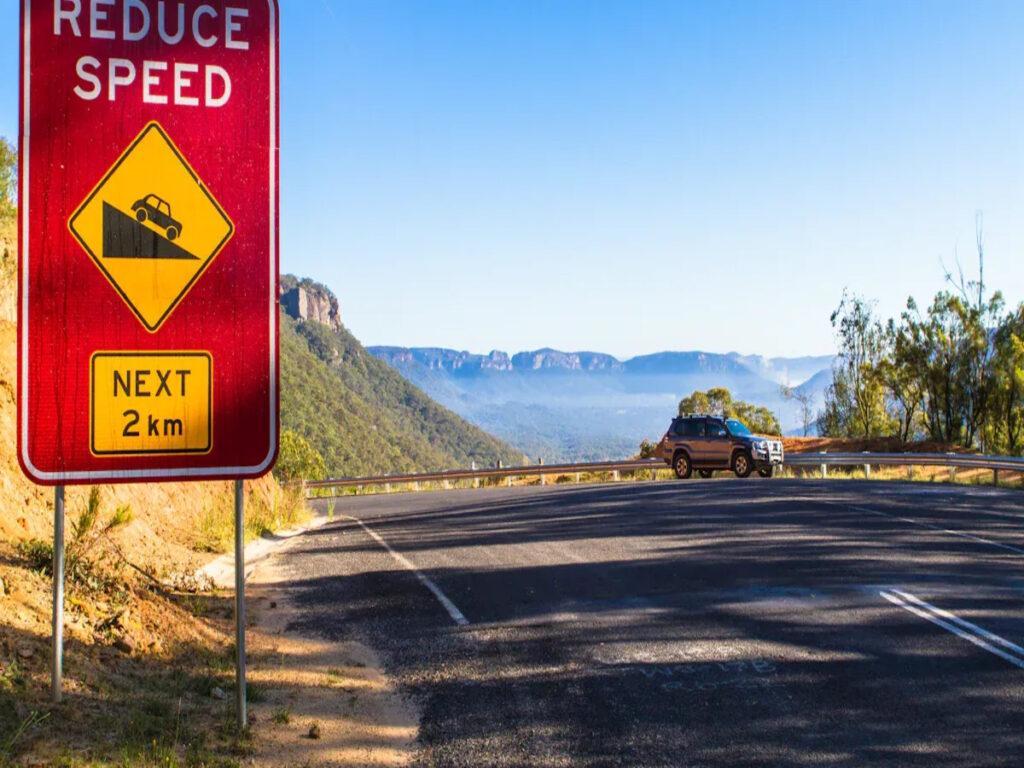
Sans Serif vs Serif in Road Signage
Most safety signs use sans serif fonts. These fonts do not have extra lines at the ends of letters. Sans serif fonts, like Arial or Clearview, are easy to read. You can read them quickly when you are near roads. This is important for drivers and people walking. Sans serif fonts stay clear at any size or distance.
Studies found sans serif fonts are easier to read than serif fonts. For example, Arial scored 0.770, and Times New Roman scored 0.748. This small difference matters for safety. People read faster with sans serif fonts, especially when the letters are small. You can see this in the table below:
| Comparison Aspect | Serif Font (Times New Roman) | Sans Serif Font (Arial) | Statistical Significance | Notes |
|---|---|---|---|---|
| Legibility Score (Road Signage) | 0.748 | 0.770 | p < 0.01 | Arial showed higher legibility scores than Times New Roman in road signage contexts. |
| Reading Speed (12-point font) | Significantly slower | Smaller difference | p < 0.004 | 12-point serif fonts read slower than 14-point serif fonts; sans serif fonts less affected. |
| Letter Height Effect | N/A | N/A | p < 0.01 | Letter height significantly affects legibility in road signage. |
| Time of Day Effect | N/A | N/A | p < 0.01 | Legibility varies significantly between daytime and nighttime conditions. |
Some studies say serif fonts help with word recognition if the stroke contrast is high. But most safety signs use sans serif fonts with low stroke contrast. These are easier to read. That is why you see sans serif fonts on most road signs. Fonts are very important for safety signs. You need clear fonts to stay safe.
Size, Spacing, and Letter Form
Font size, spacing, and letter form are important for reading safety signs. Big letters are easier to see from far away. Good spacing stops the words from looking crowded. When you drive, you must read signs quickly. Good typography helps you do this.
Research shows that bigger fonts and good line spacing make reading easier. You do not have to work hard to read the sign. This means you react faster to warnings or directions. Important things for readability are x-height, stroke thickness, and character spacing. A bigger x-height helps you read small letters. Stroke thickness should be at least 0.25pt to 0.3pt for clear letters. Line spacing should be 2-4 points more than the font size.
- Look for these features in safety signs:
- Big, bold letters
- Enough space between each letter
- Simple, familiar letter shapes
A study found type width matters more than spacing, but both are important. The right font size and spacing can make signs up to 20% easier to read. This helps a lot, especially when driving fast or in bad weather.
Tip: Always check that safety signs use big, clear letters with enough space. This helps everyone read them quickly and stay safe.
Colour Contrast and Visibility
Colour contrast is very important for safety signs. High-contrast colours, like white letters on blue or green, make signs stand out. You need this in all types of light, day or night. Good contrast helps you see signs in bright sun or rain.
Statistical models show high-contrast colours make signs easier to see. For example, artificial neural networks had 81% accuracy in checking colour status for road signs. Regression analysis showed a strong link between colour quality and sign visibility. As signs get older, their colours fade and they are harder to see. This shows why keeping colours bright and clear is important.
| Analysis Aspect | Details |
|---|---|
| Models Used | Random Forest (RF), Support Vector Machine (SVM), Artificial Neural Network (ANN) |
| Tasks | Classification (colour status: accepted/rejected), Regression (daylight chromaticity) |
| Key Statistical Findings | – ANN classification accuracy: 81% |
| – ANN regression R2: 97% | |
| – RF accuracy: 74%, SVM accuracy: 79% | |
| – RF and SVM regression R2: 59% to 92% | |
| Regression Analysis | Linear relationship between road sign age and daylight chromaticity for blue, green, red, and white colours |
| Implication | Quantifies how colour degradation over time affects visibility, supporting the role of high contrast colour schemes in enhancing road sign visibility under varied lighting conditions |
You should always look for safety signs with strong colour contrast. This makes the message easy to see and read. This is very important for your safety. Typography is not just about the font. It is also about size, spacing, letter form, and colour contrast.
Note: Typography is more than just picking a font. You must think about size, spacing, letter form, and colour contrast to make safety signs work well.
Typography changes how you see and understand safety signs. The right font, size, spacing, and colour make signs easier to read. This keeps you and others safe on the road.
Standards in Road Signage
Regulatory Guidelines (AS 1742, TSRGD)
There are strict rules for making safety signs. In Australia, AS 1742 tells you how to make signs easy to read. This standard says what font, letter size, spacing, and colour contrast to use. These rules help drivers and people walking see signs quickly. The Transport Heavy font is often used because it fits these rules.
In the United Kingdom, TSRGD gives similar advice. It explains which fonts and layouts are best for safety. Both AS 1742 and TSRGD want signs to be simple and clear. You should always check these rules before making or changing any safety sign.
Note: If you follow these rules, your signs will meet the law and help keep roads safe for everyone.
Consistency and Recognition
You see lots of different signs every day. Using the same font, size, and colours for all safety signs helps people spot them faster. When road signs look the same, people trust them and react quickly in danger. If you change fonts or colours, it can confuse drivers and people walking.
Always use the same style for every safety sign. This helps you notice important messages, even from far away or when driving fast. Consistent signs also help people who travel to new places. They know what to look for and can follow the rules.
- Use the same font on every safety sign.
- Keep letter size and spacing the same.
- Pick colours that stand out for better visibility.
If you do these things, road signs work better. You also help keep everyone safe on the road.
Common Fonts and Mistakes

Effective Fonts in Safety Signs
You see lots of fonts on street signs, but only a few are good for safety. In Australia, Transport Heavy is used for warning and danger signs. This font has thick, bold letters that you can see from far away. Clearview is another font used in many countries. It helps people read signs quickly, even at night.
Some fonts, like Wayfinding Sans, work even better. Wayfinding Sans has tall letters and strong shapes. These features help you notice danger signs from a long distance. The table below shows how different fonts do in real tests:
| Typeface | Performance Summary | Key Features |
|---|---|---|
| Wayfinding Sans | Best legibility, longest viewing distance | Large x-height, bold strokes |
| Clearview | High legibility, good at night with thicker strokes | Open shapes, mixed case |
| Transport Heavy | Standard in Australia, reliable for warning and danger signs | Bold, simple forms |
| Arial | Average legibility, less clear for emergency signs | Closed forms, less differentiation |
| Futura | Poor legibility, not used for warning signs | Small x-height, geometric design |
You need fonts that are easy to read in all weather. Clear fonts help you react faster to warning or emergency signs. This keeps you safe.
Pitfalls to Avoid
Not every font is good for road signs. Some fonts can make signs hard to read. Fancy fonts or ones with thin lines are not good for danger signs. If the letters are small or too close, you might miss a warning. Bad colour contrast can also hide important messages, especially on emergency signs.
Common mistakes are:
- Picking fonts with short letters or tiny details
- Using colours that do not stand out
- Making letters too close or too small
Tip: Always make sure fonts on street signs are bold, simple, and easy to see. This helps you spot warning and danger signs fast, even in bad weather.
Research shows fonts made for signs, like Clearview and Transport Heavy, help you read warning and danger signs faster than normal fonts. When you avoid these mistakes, roads are safer for everyone.
You play a key role in road safety when you choose the right font for signs. The best font gives you clarity and helps you spot warnings quickly. Always follow standards for safety signs. Pick a font with bold, simple letters. Make sure the font size is large and spacing is clear. Good font choice improves safety for everyone on the road. Remember, clear font means better safety.
Tip: Review your signs often. A clear font keeps every road user safe.
FAQ
What font do most Australian road signs use?
You usually see Transport Heavy on Australian road signs. This font has thick, bold letters. You can read it easily from a distance. It helps you spot warnings and directions quickly.
Why do road signs avoid decorative fonts?
Decorative fonts can confuse you. They have extra lines or shapes that make words hard to read. Road signs use simple, bold fonts so you can understand messages fast, even when you drive quickly.
How does font size affect road safety?
Large font size helps you read signs from far away. You get more time to react to warnings or directions. Small letters can make you miss important information, especially when you drive at speed.
What is the role of colour contrast in road safety signs?
High colour contrast makes words stand out. You can see signs clearly in bright sun, rain, or at night. For example, white letters on a blue background help you read messages quickly.
Can using the wrong font cause accidents?
Yes, the wrong font can slow your reaction. If you cannot read a sign quickly, you might miss a warning. Clear, bold fonts help you stay safe by making messages easy to see and understand.
