다문화 환경에서 일관된 색상 해석 보장: 안전 사인 제조업체의 모범 사례
직장 안전은 명확하고 이해하기 쉬운 의사 소통이 필요합니다. 안전 징후는 사고를 중단하는 데 도움이됩니다, 그러나 색상 혼란이 발생할 수 있습니다. 예를 들어, 빨간색은 어떤 곳에서는 위험을 의미하지만 다른 곳에서는 운이 좋다. 이러한 차이로 인해 다양한 직장에서 안전 징후가 이해하기 어렵습니다..
Optraffic과 같은 안전 사인 제조업체는 글로벌 규칙을 따르고 문화를 존중하는 신호를 만들어이를 해결합니다.. 이것은 작업장을 더 안전하게 만들고 사고를 최대 25%. 다음 규칙에 따라, Optraffic은 기업이 큰 벌금과 법적 문제를 피하도록 도와줍니다, 모든 사람을 안전하게 지키십시오.
10 안전 사인 제조업체에게 물어 보는 질문
좋은 안전 표지 제조업체를 선택하면 혼란스러울 수 있습니다.. 현명한 질문을 하는 것은 많은 도움이 됩니다. 잘 작동하는 신호를 얻을 수 있도록 보장합니다., 마지막으로, 그리고 규칙을 따르세요. 빨리 사라지거나 안전법을 위반하는 표지판은 원하지 않습니다., 오른쪽? 안전표지 제조업체를 주의 깊게 확인하면 큰 실수를 피할 수 있습니다.. 또한 직장을 안전하고 합법적으로 유지합니다.. 이제 조사를 하면 시간이 절약됩니다., 돈, 나중에 스트레스 받음.
How to Choose a Safety Signs Supplier for Industrial and Construction Projects (2026)
Find out how to evaluate a safety signs supplier for industrial and construction projects — certifications, 재료 사양, bulk pricing, and OSHA compliance explained
저조도 환경에서 가시성 향상: 반사율이 높은 안전표지 색상 전략
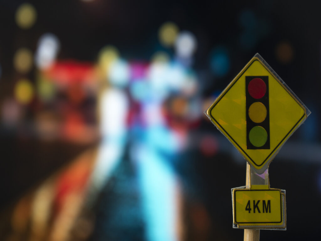
조명이 약한 지역에서는 안전 표지판을 보기가 어렵습니다.. 밝은, 반사 색상은 이 문제를 해결하는 데 도움이 됩니다.. 그들은 빛을 당신의 눈으로 반사시킵니다, 어둠 속에서도 표지판을 볼 수 있도록. 예를 들어, 연구에 따르면 정지 신호가 밝을수록 야간 충돌 사고가 줄어드는 것으로 나타났습니다. 4.4%. 수시티에 위치, 교통 표지판 개선으로 사고 감소 38%. 이것은 안전 표시 색상이 어두운 곳에서도 더 안전하게 유지된다는 것을 증명합니다..
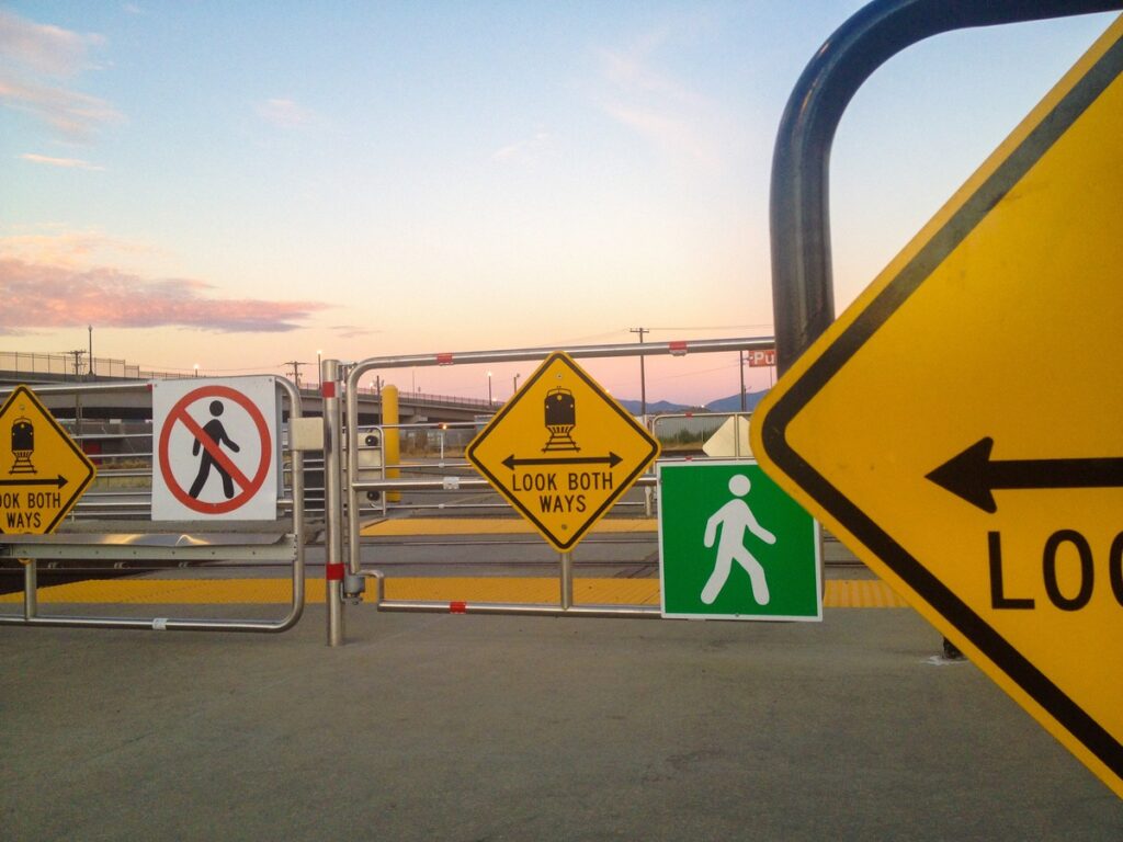
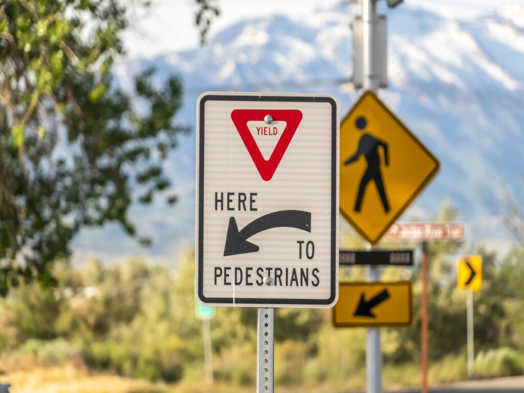
안전표지 디자인의 행동 지침에 대한 색상 및 그래픽 조합의 영향
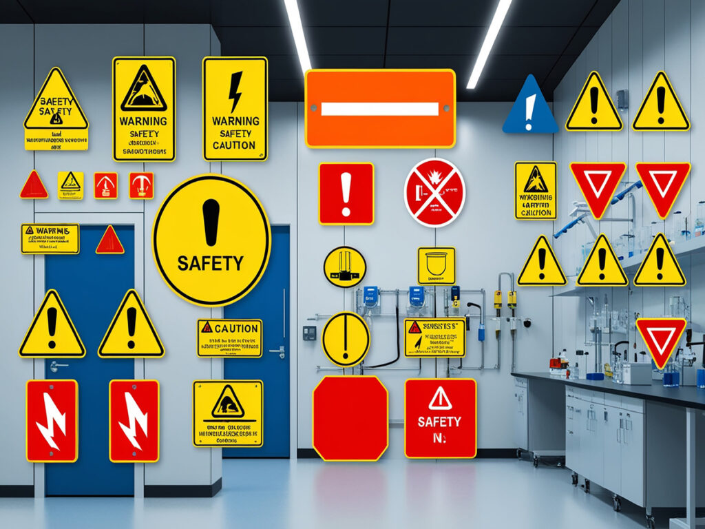
안전 표지는 행동을 안내하고 작업장 안전을 유지하는 데 매우 중요합니다.. 안전표지 색상과 그래픽을 함께 활용하면 표지판의 가시성과 효율성이 향상됩니다.. 예를 들어, 연구에 따르면 소방 표지판의 이해율은 다음과 같습니다. 74.70%. 이는 효과적인 안전표지 색상과 이미지가 개인이 안전표지를 빠르게 인식하는 데 도움이 된다는 것을 보여줍니다.. 추가적으로, 연구에 따르면 노란색 배경이 위험 요소의 가시성을 향상시키는 것으로 나타났습니다.. 이는 사람들이 표지판에 반응하는 방식에 대한 색상 선택의 영향을 강조합니다.. 이러한 개념을 이해함으로써, 안전 메시지를 효과적으로 전달하는 표지판을 만들 수 있습니다..
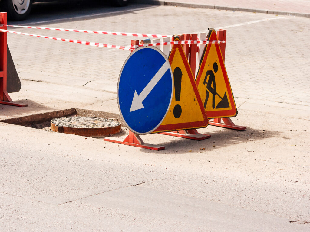
안전표지 디자인에서 오해의 소지가 있는 색상 조합 방지: 일반적인 실수와 모범 사례
안전표지를 만들 때 색상은 매우 중요합니다. 신속하게 경고를 표시합니다., 규칙, 또는 안전한 조치. 경고 표시의 색상은 중요한 정보를 효과적으로 전달하는 데 중요한 역할을 합니다.. 잘못된 색상 선택은 사람들을 혼란스럽게 하고 속도를 늦출 수 있습니다.. 예를 들어, 대비가 낮거나 색상이 충돌하면 표지판을 보기가 어렵습니다.. 위험한 곳에서는 사고로 이어질 수 있습니다. 표지판에 올바른 색상 규칙을 사용하면 표지판이 명확해지고 실수가 방지됩니다..


